13.Grid
13.1GridView Summary
Summary | Shows tabular data on a grid. |
|---|---|
Features |
|
Major Usage |
|
Video Guide |
The following shows the properties related to major functions of the GridView.
Property | Function |
|---|---|
autoFit | Displays the GridView to the full width of the window.
|
visibleRowNum | Set the number of the rows to display per page.
|
defaultValue | Set the default value to be displayed on the newly added row. |
hidden | Shows/Hides columns. |
textAlign | Sets the alignment of the text to be displayed on each cell. |
readOnly | Allows or prevent data editing in each cell or in the entire grid. |
sortable | Allows sorting in the column. |
resize | Allows adjust of the column width. |
hideHeader | Shows/Hides the header. |
fixedColumn | Sets the number of the columns to fix on the screen. |
focusMode focusMove keyMoveEditMode editModeEvent | Sets focus moving, key moving, and editing mode. |
tooltipDisplay | Displays cell data as a tooltip upon the end user’s hovering the mouse over each cell. |
colMerge upperColumn | colMerge="true" is to merge rows that have a same value and are on the same column. upperColumn is to merge columns from the column on which rows are merged. |
13.2GridView Structure
Figure 13-1.GridView Structure

13.2.1GridView
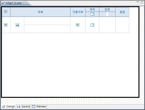
As shown below, select the outer line of the GridView and set the properties for the entire GridView.
Figure 13-2.Entire GridView
13.2.2Body
For gridView.column, the developer can set various inputType to display the GridView body in the most suitable way to the situation.
13.2.3Header
The developer can also define various inputType in the header same as in the body. Note, however, that more input types are supported in the body.
Select the header cell on the Design view, and define the inputType. inputType and dataType that can be used in the header are as shown in the table below. (The default is text.)
inputType | Description | Preview |
|---|---|---|
text | Displays as plain text. |
|
text (& dataType = "own") | The cell value is the body column ID to refer to. Text input is allowed. |
|
checkbox | The cell value is the body column ID to refer to. Select/Unselect option provided. |
|
select | The cell value is the body column ID to refer to. For single choice. |
|
13.2.3.1Properties by inputType
Basically same as the properties of the body cell, but the properties are limitedly supported in the header. See the following table.
property | InputType & dataType | |||
|---|---|---|---|---|
text | text & own | checkbox | select | |
allOption | × | × | × | ○ |
chooseOption | × | × | × | ○ |
chooseOptionLabel | × | × | × | ○ |
colspan | ○ | ○ | ○ | ○ |
dataType | ○ | ○ | × | × |
hidden | ○ | ○ | ○ | ○ |
id | ○ | ○ | ○ | ○ |
inputType | ○ | ○ | ○ | ○ |
localeRef | ○ | ○ | × | × |
rowspan | ○ | ○ | ○ | ○ |
sortable | ○ | ○ | ○ | ○ |
textAlign | ○ | ○ | ○ | ○ |
useLocale | × | × | × | ○ |
value | ○ | ○ | ○ | ○ |
width | ○ | ○ | ○ | ○ |
onChangeFunction | × | ○ | ○ | ○ |
sortable property with the filtering function. (Note, however, that multiSort() API and filtering can be used together.)* inputType="text" dataType="own"
* inputType="select
Figure 13-3.Header inputType and dataType
13.2.3.2Header Merge
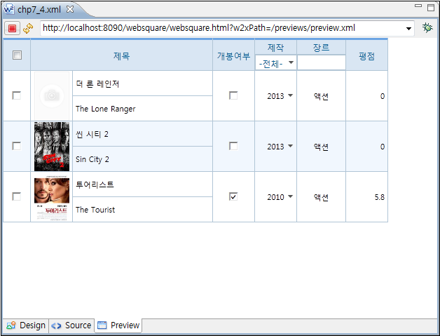
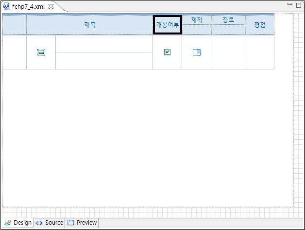
Select a series of rows adjacent to each other in the same column while holding the <Ctrl> button. (rowSpan) Merging consecutive columns on the same row is also possible. (colSpan)
Figure 13-4.Cell Merge - Before
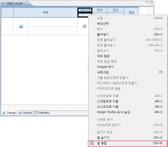
Figure 13-5.Cell Merge - After
13.2.3.3Header Text Alignment
textAlign is to align the text to the left, right, or center. The default value of the textAlign is center.
13.2.3.4Header Text
Set the text to be displayed on the header cell as described below:
Double-click the cell, and enter the text.
Or, use
setHeaderValue( headerId , value )API to dynamically change the text.
13.2.4subTotal & total
Summary | Shows the subtotal and the total of the column. |
|---|---|
Related Properties |
|
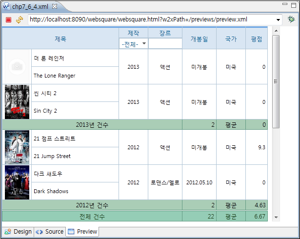
The following expression can be used for the subTotal and the total of the GridView.
Expression function | Description |
|---|---|
| Minimum value in the specified column |
| Maximum value in the specified column |
| Sum of the rows in the specified column |
| Average of the specified column |
<w2:subTotal id="subTotal1"
  style="" targetColumnID="pubDate">
  <w2:row id="row5" style="">
    <w2:column id="column22"
      style="height:20px" width="40"
      inputType="text">
    </w2:column>
    <w2:column id="column21"
      style="height:20px" width="425"
      inputType="expression" colSpan="5"
      rowSpan="" value="Yearly count"
      textAlign="" expression="max('pubDate')"
      displayFormatter="setTitle">
    </w2:column>
    <w2:column id="column54"
      style="height:20px" width="70"
      inputType="expression" value=""
      textAlign="right" expression="sum('cnt') ">
    </w2:column>
    <w2:column id="column15"
      style="height:20px" width="60"
      inputType="text" value="Average">
    </w2:column>
    <w2:column id="column14"
      style="height:20px" width="45"
      inputType="expression" expression="avg('userRating')"
      dataType="number" displayFormat="##.##"
      textAlign="right">
    </w2:column>
  </w2:row>
</w2:subTotal>
<w2:footer id="footer1" style="">
  <w2:row id="row8" style="">
    <w2:column id="column49"
      style="height:20px" width="40"
      inputType="text">
    </w2:column>
    <w2:column id="column48"
      style="height:20px" width="425"
      inputType="text" colSpan="5"
      rowSpan="" value="Total Count"
      textAlign="">
    </w2:column>
    <w2:column id="column62"
      style="height:20px" width="70"
      inputType="expression" value=""
      textAlign="right" expression="sum('cnt') ">
    </w2:column>
    <w2:column id="column42"
      style="height:20px" width="60"
      inputType="text" value="Average">
    </w2:column>
    <w2:column id="column41"
      style="height:20px" width="45"
      inputType="expression" expression="avg('userRating')"
      dataType="number" displayFormat="##.##"
      textAlign="right">
    </w2:column>
  </w2:row>
</w2:footer>
그림 13-6.SubTotal and Total
13.2.4.1Showing/Hiding subTotal
setSubtotalVisible(true); is to display the subTotal.
setSubtotalVisible(false); is to hide the subTotal.
13.2.4.2Applying Separate CSS to subtotal
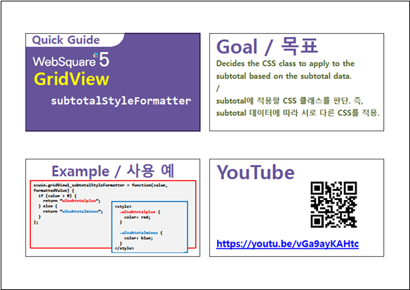
The subtotalStyleFormatter property allows to define CSS to be applied to the subtotal. In other words, different CSS can be applied to subtotal data based on the specified conditions.
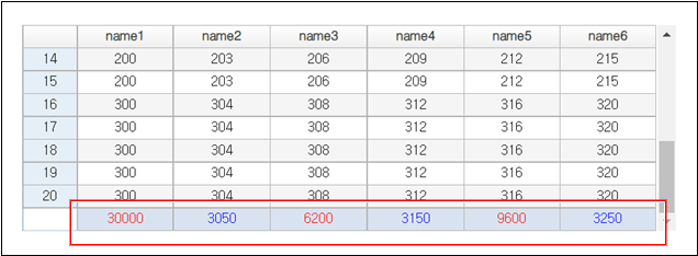
For subtotalStyleFormatter="scwin.styleFormatter", define scwin.styleFormatter() as shown below in order to apply different CSS to subtotal data. In the following example, when the subtotal is larger than 5000, w2subtotalbig will be applied, and when subtotal is not higher than 500, w2subtotalsmall class will be applied.
Code 13-1.subtotalStyleFormatter Example
scwin.styleFormatter = function(value, formattedValue) {
  if (value > 5000) {
    return "w2subtotalbig";
  } else {
    return "w2subtotalsmall"
  }
}
Code 13-2.Style (Example)
.w2subtotalbig {
  color: red;
}

.w2subtotalsmall {
  color: blue;
}
Figure 13-7.subtotalStyleFormatter=""
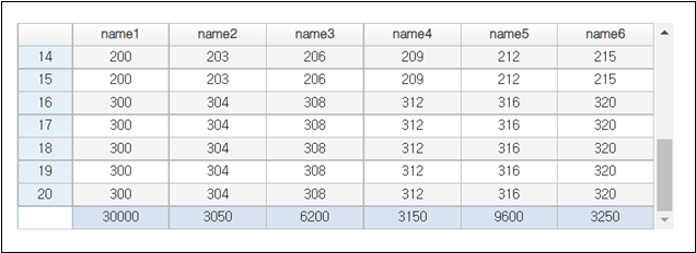
Figure 13-8.subtotalStyleFormatter="scwin.styleFormatter"
Download from the Internet or
View in WEBSQUARE_DEV_PACK (/GridView/_General/subtotalStyleFormatter_GridView.xml)
Figure 13-9.YouTube Video (https://youtu.be/vGa9ayKAHtc)
13.2.5Footer
Related Properties |
|
|---|
13.2.5.1Creating Footer
13.2.5.2Footer Title
Condition | Result (Created Footer) |
|---|---|
captionTitle="Title" footerCaption="Footer" footerCaptionAuto="true" | "Footer" |
captionTitle="Title" footerCaption="" footerCaptionAuto="true" | "Table Displaying the Sum of Title" |
13.2.5.3Creating footerSummary
With the footerSummaryAuto property, automatically create footer summary as described below:
Condition | Summary |
|---|---|
footerSummaryAuto="false" | No summary will be created. |
footerSummaryAuto="true" captionTitle="Title" footerSummary="" | summary="Table Displaying the Sum of Title" |
footerSummaryAuto="true" captionTitle="" footerSummary="Footer Summary" | summary="Footer Summary" |
13.2.5.4Handling Floating Point Precision Issue in JavaScript (SUM and AVG)
By setting the inputType of the footer as "expression" and adding expression=SUM("column") or expression=AVG("column"), the developer can get the sum or average of the data of the corresponding column.
In case the data in the column to get the sum or average is decimal numbers, add the following to handle the floating point precision issue of the JavaScript.
Body column (gridView.column) –
dataType="bigDecimal"Footer column (gridView.column) –
dataType="bigDecimal"Add the following in the config.xml file.
Code 13-3.config.xml (Handling Floating-number Precision Issue in JavaScript)
<engine>
        <module src="/websquare/externalJS/big/big.min.js"/>
</engine>
Note, however, that the above is required for the WebSquare Engines released before November 2020. WebSquare Engines released since November 2020 provides automatic handling of the floating point precision issue of JavaScript, hence does not require above setting.
For the WebSquare Engines released since November 2020 does not require additional settings to support SUM operation of the decimal numbers.
For the WebSquare Engine released since December 2020 does not require additional settings to support AVG operation of the decimal numbers.
13.2.6Editing GridView Table
13.2.6.1Adding Columns/Rows
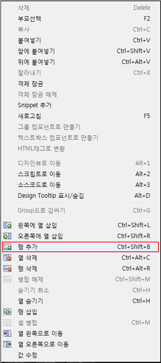
Right-click the body cell.
Select Add Row , Insert to the Left, or Insert to the Right.
Figure 13-10.Adding Body Rows of the GridView
13.2.6.2Row/Column Merge
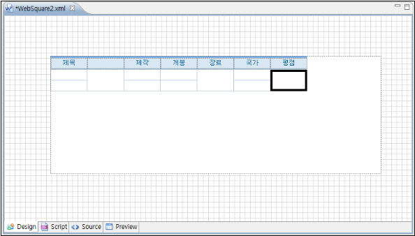
Select a series of rows adjacent to each other in the same column while holding the <Ctrl> button. (rowSpan) Merging consecutive columns on the same row is also possible. (colSpan)
Figure 13-11.Cell Merge
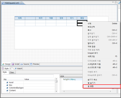
Figure 13-12.Cell Merge
13.3gridView.column
The developer can set properties for each column of the GridView.
13.3.1inputType
13.3.1.1Setting inputType
The developer can set different inputType for each column in the GridView.
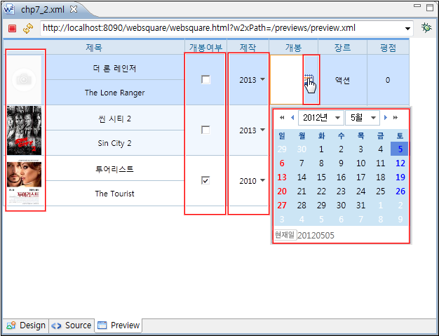
The following table shows various inputType. The default is text.
Types | Description | Preview |
|---|---|---|
text | Plain text (Similar to InputBox.) |
|
link | Underlined, bold text |
|
checkbox | Selection/Unselection by true/false setting. Multiple selection is possible. |
|
button | button |
|
image | Image |
|
radio | Selection/Unselection by true/false. Single choice is allowed. |
|
select | Provides a SelectBox-like UI. Among the selection items of the SelectBox, the corresponding label for the cell value will be displayed. |
|
calendar | Displays the calendar icon. By clicking the calendar icon, the end user can select a date. (Default format: yyyy-MM-dd) (Similar to InputCalendar.) |
|
expression | Uses a calculation function, and displays the calculation result. The developer can define a function by referring to other columns. Example: | |
textarea | Multi-line text | |
drilldown | Tree with + and - buttons |
|
textImage | General text. Displays icon. By defining the event handler ( |
|
checkcombobox | A combination of CheckBox and SelectBox. Multiple selection is allowed. |
|
autoComplete | Auto-completes the text. |
|
secret | Hides the text. |
|
Figure 13-13.Setting Various inputType (inputType="image" / "checkbox" / "select" / "calendar")
13.3.1.2Properties by inputType
Depending on the inputType, different properties can be set in the body column. For more information, see the API Guide.
inputType | Major Properties |
|---|---|
inputType = "text" |
|
inputType = "image" |
|
inputType = "calendar" |
|
inputType = "checkbox" |
|
inputType = "select" |
|
13.3.1.3Displaying Icons by inputType
Description |
|
|---|---|
Related APIs |
|
13.3.1.4Dynamically Setting inputType
Description |
|
|---|---|
Using Method |
|
Code 13-4.inputType="custom" and typeGetter
<?xml version="1.0" encoding="UTF-8"?>
<html ... >
...

    <head>
        <script type="javascript" lazy="false">
            <![CDATA[
        var cnt=0;
        var getType = function( info ) {
            ...
        }
    ]]>
        </script>
    </head>
    <body>
...

        <w2:gridView ... >
            <w2:header ... >
        ...
    </w2:header>
            <w2:gBody id="gBody1">
                <w2:row id="row1">
                    <w2:column id="c0" inputType="text"></w2:column>
                    <w2:column id="c1" inputType="custom" typeGetter="getType"></w2:column>
                    <w2:column id="c2" inputType="custom" typeGetter="getType"></w2:column>
                </w2:row>
            </w2:gBody>
    ...

        </w2:gridView ... >
    </body>
</html>The typeGetter function must be loaded when the GridView is rendered in order to dynamically change the inputType of the GridView.
The function to be defined as the typeGetter has parameters and returns as shown below:
Parameter | Return |
|---|---|
|
|
Code 13-5.Return Example of typeGetter
returnInfo = {
    id: "dynamic_select_" + cnt,
    inputType: "select",
    options: {
        viewType: "icon"
    },
    itemSet: {
        nodeset: "data:dataList2",
        label: "label",
        value: "value"
    },
    value: "select"
}13.3.1.5Hiding Some of Selection Items Depending on the inputType
If gridView.column has one of the following inputType and displays selection items through the DataList bound with the GridView column, the developer can hide some of the selection items using setColumnVisibleColumn() function.
inputType="autoComplete"inputType="checkbox"inputType="checkcombobox"inputType="radio"inputType="select"
The items to be hidden are decided based on the data of the specified column in the DataList bound with the GridView column. Specify the GridView Column, the column of the DataList, and the condition required to hide the selection items as parameters of setColumnVisibleColumn() function as shown below.
Code 13-6.Example
// (Condition)
// column1 of GridView has inputType="select".
// column1 is bound with dataList1.

// (Execute.)
gridView1.setColumnVisibleColumn("column1", "Type", "true");

// (Result)
// Items of which Type column value is “true” in dataList1,
// will not be displayed on the SelectBox on column1 of GridView.Download from the Internet or
View in WEBSQUARE_DEV_PACK
(/GridView/_General/setColumnVisibleColumn_GridView/)
Figure 13-14.YouTube Video (https://youtu.be/TG3nZBI8msE)
13.3.1.6Disabling Some of Selection Items Depending on the inputType
If gridView.column has one of the following inputType and displays selection items through the DataList bound with the GridView column, the developer can disable some of the selection items using setColumnEnableColumn() function.
inputType="autoComplete"inputType="checkbox"inputType="checkcombobox"inputType="radio"inputType="select"
The items to be disabledare decided based on the data of the specified column in the DataList bound with the GridView column. Specify the GridView Column, the column of the DataList, and the condition required to disable the selection items as parameters of setEnableColumn() function as shown below.
Code 13-7.Example
// (Condition)
// column1 of GridView has inputType="select".
// column1 is bound with dataList1.

// (Execute.)
gridView1.setColumnEnableColumn("column1", "Type", "false");

// (Result)
// Rows of which Type column is “false” in dataList1,
// will be disabled on the selection list displayed on column1 of GridView.Download from the Internet or
View in WEBSQUARE_DEV_PACK
(/GridView/_General/setColumnEnableColumn_GridView.xml)
Figure 13-15.YouTube Video (https://youtu.be/0IybbS4LnxU)
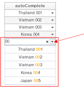
13.3.1.7inputType="autoComplete"
Figure 13-16.inputType="autoComplete"
13.3.1.7.1directOpen
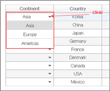
In case of viewType="icon" and viewTypeIconImage="true", an arrow image will be displayed on the AutoComplete box of the GridView. In this case, setting as directOpen="true" will open the selection item list upon the end user’s clicking the arrow image.
Figure 13-17.directOpen="true"
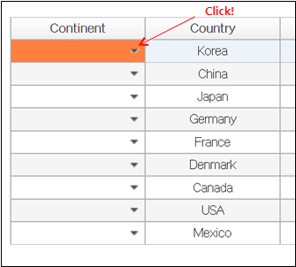
When directOpen="false" is set, end user’s clicking the arrow image will only select the cell. Double-clicking the arrow image will open the selection item list.
Figure 13-18.directOpen="false"
Download from the Internet or
View in WEBSQUARE_DEV_PACK
(/GridView/inputType/inputType_autoComplete_directOpen_gridView_column.xml)
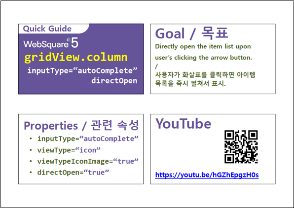
Figure 13-19.YouTube Video (https://youtu.be/hGZhEpgzH0s)
13.3.1.8inputType="checkbox"
13.3.1.8.1checkboxLabelColumn
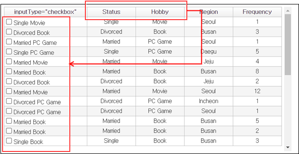
For inputType="checkbox" columns, a combination of other column values can be used as the checkbox label. Set the checkboxLabelColumn property as the column IDs of which values will be combined to be used as the checkbox label.
Figure 13-20.checkboxLabelColumn=""
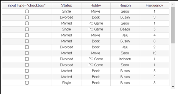
Figure 13-21.checkboxLabelColumn="Status,Hobby"
Download from the Internet or
View in WEBSQUARE_DEV_PACK
(/GridView/_General/checkboxLabelColumn_radioLabelColumn_gridView_column/)
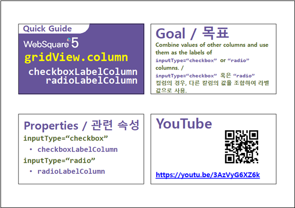
Figure 13-22.YouTube Video (https://youtu.be/3AzVyG6XZ6k)
13.3.1.8.2checkAllType (GridView)
For the inputType="checkbox" header, the developer can decide whether to include disabled or readOnly cells when selecting all cells in the column by clicking the checkbox in the header.
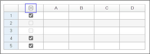
In the following example, the two rows are not selected and this status are included ("include") for judging whether all cells in the column are selected. The status of the two rows not selected are included for judging the entire column cell selection status. Hence, not all cells in the column are selected. As a result, the partial selection symbol is displayed.
Figure 13-23.checkAllType="include"
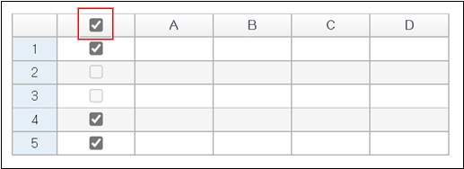
In the following example, two cells are not selected and are excluded ("exclude") from judging whether all cells in the column are selected. The status of the two rows not selected are excluded from judging the entire column cell selection status. Hence, (excluding unselected cells) all cells in the column are selected. As a result, the all selection symbol is be displayed.
Figure 13-24.checkAllType="exclude"
Download from the Internet or
View in WEBSQUARE_DEV_PACK(/GridView/_General/checkAllType_GridView.xml)
Figure 13-25.YouTube Video (https://youtu.be/LzioAerK1g0)

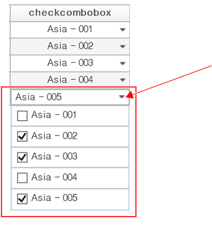
13.3.1.9inputType="checkcombobox"
Figure 13-26.inputType="checkcombobox"
13.3.1.10inputType="drilldown"
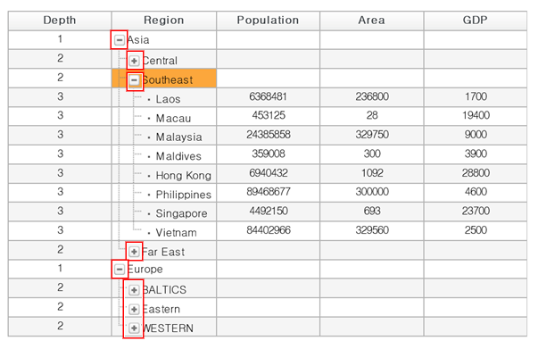
GridView provides a drill-down type column for the end user to fold or open multiple rows as a tree-structured menu. There must be a column that contains menu depth information, and this column must be set as the depthColumn Other related properties are as shown below.
| Column containing menu depth information. |
|---|---|
| Menu depth on the GridView. |
| How to display upper and lower menus. |
Figure 13-27.inputType="drilldown"
13.3.1.11inputType="radio"
13.3.1.11.1radioLabelColumn
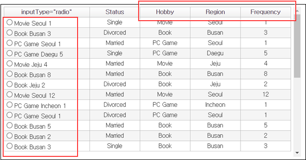
For inputType="radio" columns, a combination of other column values can be used as the radio label. Set the radioLabelColumn property as the column IDs of which values will be combined to be used as the radio label.
Figure 13-28.radioLabelColumn=""
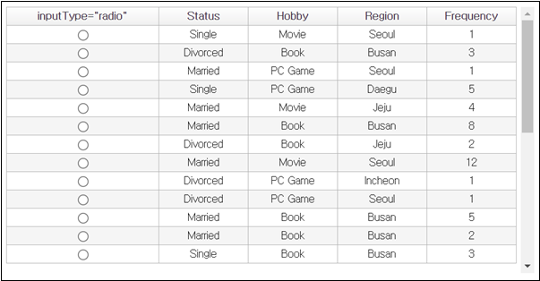
Figure 13-29.radioLabelColumn="Hobby,Region,Frequency"
Download from the Internet or
View in WEBSQUARE_DEV_PACK
(/GridView/_General/checkboxLabelColumn_radioLabelColumn_gridView_column/)
Figure 13-30.YouTube Video (https://youtu.be/3AzVyG6XZ6k)

13.3.1.12inputType="select"
Figure 13-31.inputType="select"

Download from the Internet or
View in WEBSQUARE_DEV_PACK
(/GridView/inputType/inputType_select_gridView_column.xml)
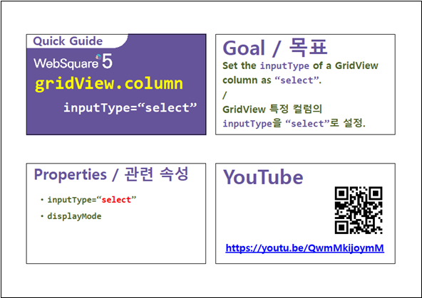
Figure 13-32.YouTube Video (https://youtu.be/QwmMkijoymM)
13.3.2Hiding Columns
hidden is to hide columns. Or, use setColumnVisible(colIndex, colVisible) API to dynamically hide columns.
Code 13-8.Example
<w2:column id="openDate" style="height:70px" inputType="calendar" width="70" rowSpan="2" displayFormat="yyyy.MM.dd" hidden="true"></w2:column>
<w2:column id="nation" style="height:70px" inputType="text" width="70" rowSpan="2" hidden="true"></w2:column>
In the following, some columns are hidden.
Figure 13-31.hidden
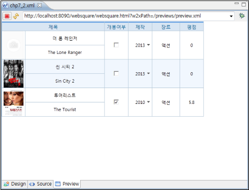
Or, use setColumnVisible(colIndex, colVisible) API to dynamically hide columns.
13.3.3Text Alignment
textAlign is to align the text to the left, right, or center. The default value of the textAlign is center.
Code 13-9.Example
<w2:column id="orgtitle" style="height:35px" inputType="text" width="200" defaultValue="Title" textAlign="left"></w2:column>
<w2:column id="userRating" style="height:70px" width="60" inputType="text" rowSpan="2" dataType="number" displayFormat="##.#" defaultValue="0" textAlign="right"></w2:column>
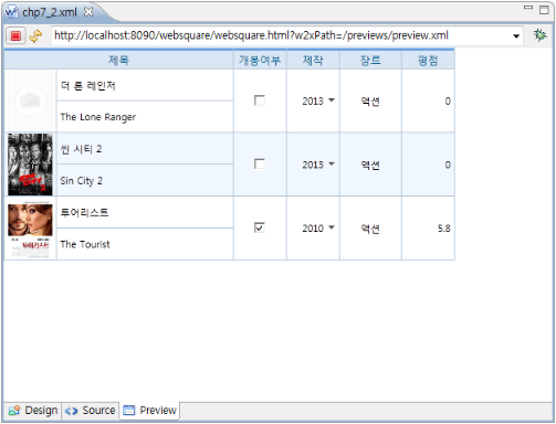
In the following example, the movie title is aligned to the left and the score is aligned to the right.
Figure 13-34.textAlign
13.3.4Format/Formatter
13.3.4.1displayFormat
gridView.colum has displayFormat property which can set the display format of the data of the corresponding column.
13.3.4.2displayFormatter
gridView.colum has displayFormatter property which is to specify the name of the function that will set the data display format of the column. The function is to be implemented by the developer.
13.3.4.3customFormatter
gridView.colum has customFormatter property which is to specify the name of the function that will set the data display format of the column. The function is to be implemented by the developer.
Valid only for following inputType:
"text"
"link"
"textImage"
"textarea"
"select"
"expression"
"spinner"
13.3.4.4Dynamically Setting displayFormatter and customerFormatter
With setCellDisplayFormatter and setCellCustomFormatter, the developer can dynamically set displayFormatter and customerFormatter properties.
Description |
|
|---|---|
Usage 2 |
|
Usage 2 |
|
Target cell |
|
Code 13-10.Example (setCellDisplayFormatter)
scwin.displayFormatter = function(param){

            return "** " + param + " **";
 };

....

grd.setCellDisplayFormatter( 2, 2, 'scwin.displayFormatter');

...
Code 13-11.Example (setCellCustomFormatter)
scwin.customFormatter = function(data, formattedData, rowIndex, colIndex ){

            return "[[ " + data + " ]]";
};

....

grd.setCellCustomFormatter( 2, 2, 'scwin.customFormatter' );

...
13.3.4.5dataList.column - importFormatter
dataList.column provides importFormatter for the developer to specify a user-defined function and to format the column data using the specified function.
13.4Adding GridView Events
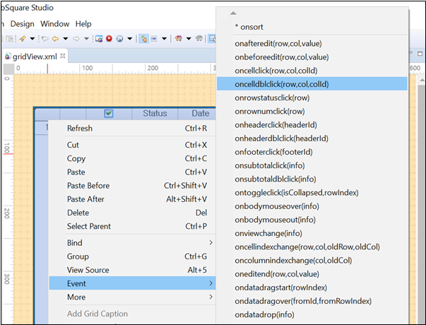
Right-click the GridView, and select Event – event to add. Then, add logic to the selected event.
Figure 13-35.Adding Events to GridView
13.4.1onsort
Upon end user’s sorting the column data by clicking or double-clicking the header with sortable specified, the onsort event will be fired.
13.4.2oncellclick
Clicking a GridView cell will fire the oncellclick event passing the row index, column index, and column ID of the selected cell as parameters.
13.4.3oncelldblclick
Double-clicking a GridView cell will fire the oncelldblclick event passing the row index, column index, and column ID of the selected cell as parameters.
13.4.4onscrollstart
The onscrollstart event is fired upon the vertical scroll reaching the top of the GridView. When alwaysTriggerScrollStart="true" is applied, the onscrollstart will be fired every time that the vertical scroll reaches the top of the GridView.
13.5Major Functions of the GridView
13.5.1Freezing Panes
13.5.1.1Fixing Columns
Description |
|
|---|---|
Related APIs |
|
Remarks |
|
Figure 13-36.Fixing Columns to the Left (fixedColumn)
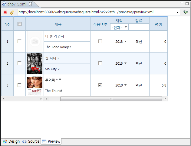
13.5.1.2Fixing Rows
Description |
|
|---|---|
Related APIs |
|
13.5.1.3Hiding the Scroll
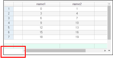
By setting fixedColumnScrollHidden, the developer can hide scroll from the fixed area.
Figure 13-37.fixedColumnScrollHidden="false"
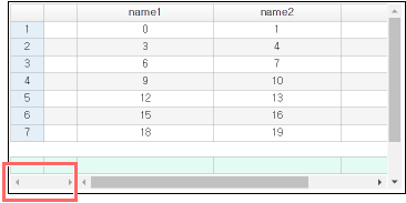
Figure 13-38.fixedColumnScrollHidden="true"
13.5.2Adjusting Column Widths
13.5.2.1Automatic Adjustment (autoFit)
Description |
|
|---|---|
Related APIs |
|
Remarks |
|
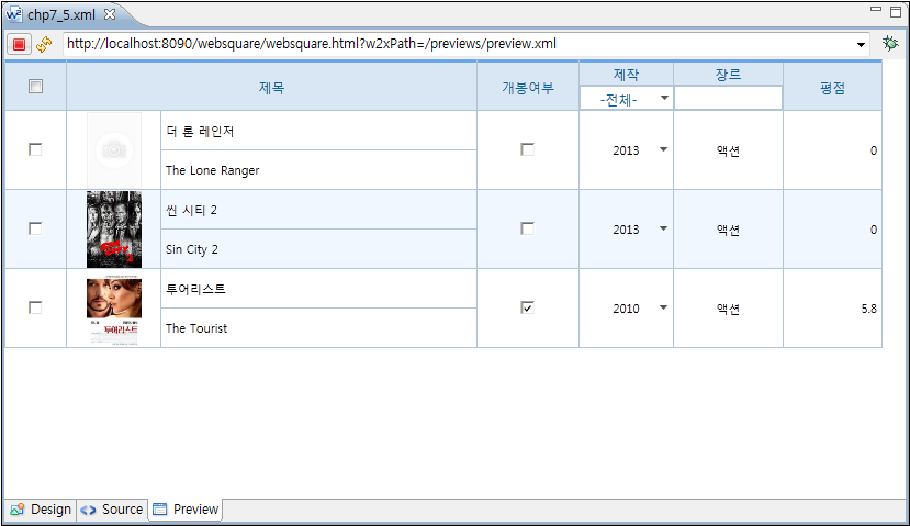
Adjusting column widths in the GridView (autoFit="allColumn" & "autoFitMinWidth") - GridView
Figure 13-39.autoFit=allColumn
13.5.2.2Adjustment through Dragging
Description |
|
|---|---|
Related APIs |
|
13.5.2.3Adjusting Width of the Row Number Column through Dragging
Description |
|
|---|---|
Related APIs |
|
13.5.2.4Setting Minimum Column Width
Description |
|
|---|---|
Related APIs |
|
13.5.3Column Number and Status Columns
13.5.3.1Display of Row Number and Status Columns
Description |
|
|---|---|
Related APIs |
|
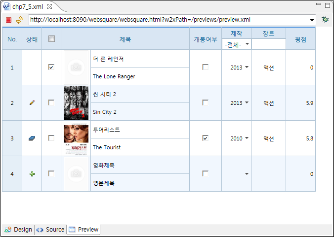
Status | StatusValue | Image | |
|---|---|---|---|
Initial Status | R | 0 | None |
Updated | U | 1 |
|
Inserted | C | 2 |
|
Deleted | D | 3 |
|
Inserted and deleted | V | 4 |
Code 13-12.Columns for Row Numbers and Row Status
<w2:grid id="grid1" baseNode="item"
  repeatNode="filmo"
  style="position: absolute ;left:0px;top:0px;width: 800px;height: 400px;"
  valueNode="" sortable="true" resize="true"
  readOnlyBackgroundColor="#D9E6F3"
  readOnly="false" hideHeader="false"
  rowNumVisible="true"
  rowNumHeaderValue="No."
  rowStatusVisible="true"
  rowStatusHeaderValue="Status">
Code 13-13.Status Change (Example)
grid1.setCellData(1, 'userRating', 5.88); // Updated status.
grid1.deleteRow(2);                       // Deleted.
grid1.insertRow(grid1.getRowCount());     // Inserted.
Figure 13-40.Showing Row Numbers and Status
13.5.3.2Multi-language
Description |
|
|---|---|
Related APIs |
|
Code 13-14.Example (Displaying Number/Status in the Header)
...
<script
    ...
    scwin.init = function(){
          WebSquare.WebSquareLang = {
            'rowNum' : 'Number',
            'rowStatus' : 'Status'
            };
    };

scwin.init();]]></script>

<w2:gridView
    ...
    rowNumLocaleRef="rowNum" rowStatusLocaleRef="rowStatus"
    rowNumVisible="true" rowStatusVisible="true"
    rowNumHeaderValue="No" rowStatusHeaderValue="Status"
    ...
</w2:gridView>

...13.5.4Moving Columns
Allows the user to move the header column of the GridView though dragging. The value of the header will be displayed as tooltip upon dragging. In case of fixed columns, the developer can separately decide whether to allow dragging or not.
- Related APIs
columnMove="true": Allows moving of the column.
fixedColumn & fixedColumnNoMove: Allows dragging of the fixed columns.
- Dragging of the fixed columns.
fixedColumn: Specify the columns to fix.
columnMove="true": Fixed columns can be also moved through dragging in case columnMove="true" setting exists.
fixedColumnNoMove="true": When the columns are fixed by fixedColumn, columnMove="true" setting will not be applied. In other words, column moving through dragging is not supported.
13.5.5Rows
13.5.5.1Dynamically Adding and Deleting Rows
In case the GridView is bound with a dataList, the developer can newly add rows by using insertRow(); or remove rows by using removeRows(); function.
13.5.5.2Getting the Data of the Selected Rows
For inputType="checkbox" or inputType="radio" columns, the developer can get the data of the selected rows:
getCheckedIndex();
getCheckedData();
getCheckedJSON();
getCheckedXML();
13.5.5.3Deleting/Removing Selected Rows
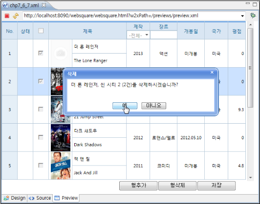
Add an inputType="checkbox" column for the end user to select rows by clicking the checkbox on the added column. Columns selected through the checkbox can be deleted or removed.
- Related APIs
inputType=“checkbox” (gridView.column)
rowStatusVisible=“true” (gridView)
getCheckedIndex(“colID”); (gridView)
ignoreStatus=“true” (dataList)
deleteRows(Arr); (dataList)
removeRows(Arr); (dataList)
Video Guide – Adding a column for row selection, selecting rows and deleting selected rows - GridView
Sample File
13.5.5.4Showing or Hiding Rows
13.5.5.5Buttons to Add, Delete, and Save Rows
Buttons can be created by Trigger or other components. These components can be used in connection with others. Using the event, the developer can control the GridView.
<xf:trigger id="trigger1"
  style="position: absolute ;left:0px;top:0px;width: 100px;height: 25px;"
  type="button">
  <xf:label>Add Row</xf:label>
  <script ev:event="onclick"
    type="javascript"><![CDATA[
      grid1.insertRow( 0 );
  ]]></script>
</xf:trigger>
<xf:trigger id="trigger2"
  style="position: absolute ;left:100px;top:0px;width: 100px;height: 25px;"
  type="button">
  <xf:label>Delete Row</xf:label>
  <script ev:event="onclick"
    type="javascript"><![CDATA[
      var chkDataArr = grid1.getCheckedData("chk");
      var dataArr = [];
      for ( var i = 0; i < chkDataArr.length; i++) {
        dataArr[i] = chkDataArr[i][2];
      }

      var qStr = dataArr.join(", ") + " ("
          + chkDataArr.length + " cases) are to be deleted? ";
      output1.setValue(qStr);
      if (chkDataArr.length == 0) {
        output1.setValue("No selected rows.");
        group3.hide();
      } else {
        group3.show();
      }

      gridReadOnly(true);
      floatingLayer1.show();
   ]]></script>
</xf:trigger>
<xf:trigger id="trigger3"
  style="position: absolute ;left:200px;top:0px;width: 100px;height: 25px;"
  type="button">
  <xf:label>Save</xf:label>
  <script ev:event="onclick"
    type="javascript"><![CDATA[
      for ( var i = 0; i < grid1.getRowCount(); i++) {
        var doc = dataList1.getRowXML(i);
        var ret = validCheck(doc, i);
        if (ret == false) {
          alert('Mandatory input field remains.');
          return;
        }
      }

      var modifiedXML = dataList1.getModifiedXML();

      alert(WebSquare.xml.indent(modifiedXML));
    ]]></script>
</xf:trigger>
Figure 13-41.Deleting a GridView Row
13.5.6Row Dragging
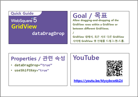
Within a same GridView, or between different GridViews, one or more rows can be moved through dragging-and-dropping.
13.5.6.1Related Properties and Functions
- Related Properties and Functions
dataDragDropand Function (Allows dragging-and-dropping.)dragDisplayColumn(Defines the column ID to display on the tooltip.)dragStartFunction/dragEndFunction(Sets functions to be executed upon start/end of mouse dragging.)useShiftKey(Allows row selection through the Shift key.)setDrillDownDragDrop()(Allows moving of the rows including theinputType="drilldown"column.)
13.5.6.1.1dataDragDrop
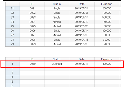
In order to allow dragging-and-dropping of the rows within the same GridView or between different GridViews, set dataDragDrop="true". In order to use the Shift key, add useShiftKey="true" setting.
Figure 13-42.Moving a Row to Another GridView
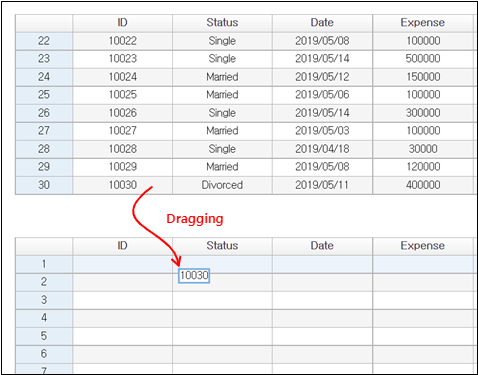
Figure 13-43.Dragged Row Moved to Another GridView
Download from the Internet or
View in WEBSQUARE_DEV_PACK(/GridView/Dragging/dataDragDrop_GridView/)
Figure 13-44.YouTube Video (https://youtu.be/Mycybcw6kZ4)
13.5.6.1.2dragStartFucntion & dragEndFunction
Define the functions to be executed upon start/end of mouse dragging as the values of dragStartFucntion and dragEndFunction properties. Note, however, the defined function must be implemented.
//Grid 1
  dataDragDrop="true"
  dragDisplayColumn="orgtitle"
  dragStartFunction="dragStart1"
  dragEndFunction="dragEnd1"
  ...

// Grid 2
  dataDragDrop="true"
  dragDisplayColumn="orgtitle, openDate"
  dragStartFunction="dragStart2"
  dragEndFunction="dragEnd2"
  ...
Code 13-15.Implementing dragStart1(), dragEnd1(), dragStart2(), and dragEnd2()
function dragStart1(rowIndex, rowXML) {
  return rowXML;
}

function dragEnd1(rowIndex, rowXML) {
  return false;
}

function dragStart2(rowIndex, rowXML) {
  grid2.removeRow(rowIndex);
  return rowXML;
}

function dragEnd2(rowIndex, rowXML) {
  grid2.setRowXML(rowIndex, rowXML, false);
  return false;
}
13.5.6.1.3setDrillDownDragDrop()
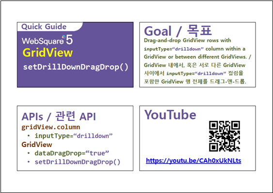
Rows with a inputType="drilldown" column can be dragged-and-dropped within a GridView containing or between different GridViews. Use setDrillDownDragDrop() function. Note, however, that the GridView must have dataDragDrop="true" setting.
Code 13-16.Example
gridView1.setDrillDownDragDrop(true);
Figure 13-45.Dragging a Row with inputType="drilldown" Column to Another GridView
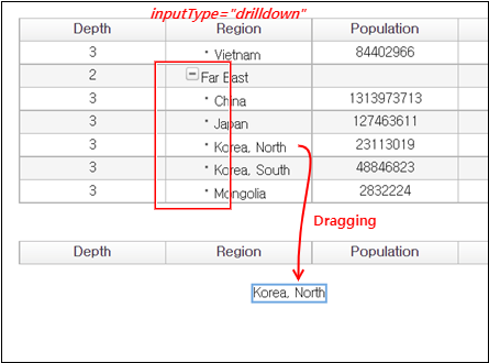
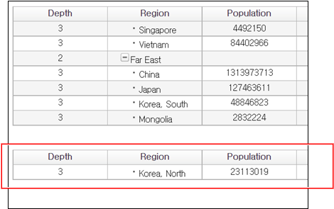
Figure 13-46.Row Dragged-and-Dropped to Another GridView
Download from the Internet or
View in WEBSQUARE_DEV_PACK(/GridView/Dragging/setDrillDownDragDrop_GridView/)
Figure 13-47.YouTube Video (https://youtu.be/CAh0xUkNLts)
13.5.6.2Selecting and Deleting Multiple Cells through Dragging
Video Guide – Selecting multiple cells through dragging (GridView)
Sample File
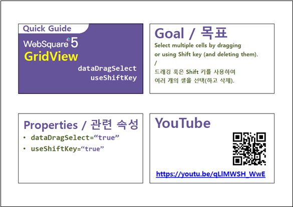
Set as useShiftKey="true" and dataDragSelect="true" to allow selection (and deletion) of multiple cells through mouse dragging of use of the Shift key.
Download from the Internet or
View in WEBSQUARE_DEV_PACK
(/GridView/Dragging/dataDragSelect_useShiftKey_GridView.xml)
Figure 13-48.YouTube Video (https://youtu.be/qLlMWSH_WwE)
13.5.6.3Dragging and Copying Multiple Cells
Video Guide – Copying multiple cells to another GridView through dragging or using Shift key
Sample File
13.5.6.4Preventing Text Selection in Dragged Cells
Set noSelect="true" to prevent selection of the text in the dragged cells.
Video Guide – Preventing selection of text in the dragged cells (GridView)
Sample File
13.5.6.5Keeping rowStatus of the Dragged-and-Dropped Cells
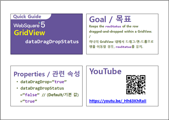
Setting as dataDragDropStatus="true" allows to keep the rowStatus of the rows moved within a same GridView. However, when the dataDragDropStatus property is set as "false", the rowStatus of the moved row will be changed to "C".
dragEndFunction function is defined. The status of the moved row must be handled by dragEndFunction.Download from the Internet or
View in WEBSQUARE_DEV_PACK(/GridView/Draggingl/dataDragDropStatus_GridView.xml)
Figure 13-49.YouTube Video (https://youtu.be/_Hh63KhRaII)
13.5.7Dynamically Setting inputType of a Cell
For inputType="custom" columns, the developer can dynamically change the inputType of a certain cell by setting as setCellInputTypeCustom="true" and using the setCellInputType() function.
Download from the Internet or
View in WEBSQUARE_DEV_PACK
(/GridView/inputType/setCellInputType_setCellInputTypeCustom_GridView/)
Figure 13-50.YouTube Video (https://youtu.be/GaGi7q3_Lps)

13.5.8Checking and Setting the dataType of a GridView Column
Using setDataType and getDataType, the developer can check and set the dataType of a certain GridView cell.
Code 13-17.Example
gridView1.getDataType ( “col1” );
// Return (Example) : "text"

gridView1.setDataType ( “col1”, “float” );
// Change the dataType of the col1 column to float.
Checking and setting the dataType of a GridView column (setDataType & getDataType) - GridView
13.5.9Setting Cell Width/Height
Use the width property and style = "height" to define the cell size. (Example: width="70" style="height:20px")
13.5.10Setting the Default Value of the Cell
The default value of the newly added cell is to be defined by defaultValue.
- When there is no data binding specified in the cell, the default value will be displayed.
XML data: There is no node name matching with the column ID.
JSON data: Where is a node name matching with the column ID.
Define the defaultValue property as shown below:
<w2:column id="orgtitle"
  style="height:35px" inputType="text"
  width="200" defaultValue="Title">
</w2:column>13.5.11Dynamically Selecting Cells
Description |
|
|---|---|
Using Method |
|
Related Properties |
|
Code 13-18.Example (1) - Specifying Area to Select Cells
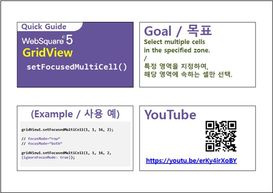
gridView1.setFocusedMultiCell(3,2,4,3);

// Execution Result:  Cells of (3,2), (3,3), (4,2), and (4,3) are selected.
Code 13-19.Example (2) - Selecting All Cells
gridView1.setFocusedMultiCell(0,0,totalRow-1,totalCol-1);

// Execution Result:  All cells are selected.
Code 13-20.Example (3) - Selecting Cells of a Certain Column
gridView1.setFocusedMultiCell(0,1,totalRow-1,1);

// Execution Result: All cells in the second column will be selected.
Code 13-21.Example (4) - When the focusMode is "row" or "both"
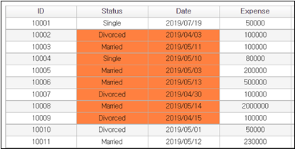
gridView1.setFocusedMultiCell(1, 1, 8, 2, {ignoreFocusMode:true});

// Only the cells in the specified area will be selected regardless of the focusMode.
Figure 13-51.For focusMode="both", setFocusedMultiCell() with {ignoreFocusMode:true} Option Executed
Download from the Internet or
View in WEBSQUARE_DEV_PACK(/GridView/_General/setFocusedMultiCell_GridView/)
Figure 13-52.YouTube Video (https://youtu.be/erKy4irXoBY)
13.5.12Cell Title
Header, cell data, label, and inputType will be combined, and to the <td>will be added the title property.
- Related APIs
titleAuto
The title is generated based on the inputType of the cell. The generation rule is as described below.
- "text" / "link" / "button"
(1) Header cell has data: "Header column title + Cell data"
(2) Header cell has no data: "Header column title + Column inputType"
- "check" / "radio"
(1) Header cell has a label value: "Selected value + label value"
(2) Header cell has no label value: "Selected value + inputType of the column"
- "select"
(1) Header cell has a label value: "Header column title + label value"
(2) Header cell has no label value: "Header column title + inputType of the column"
The titleAuto property is not supported in one of the following cases.
In these cases, the title property of each cell must be directly defined.
(1) Header or body cells are merged.
(2) Header has two rows.
(3) Other inputType than inputType="text"
13.5.13Focusing, Moving Focus, and Editing
Description |
|
|---|---|
Related APIs |
|
The GridView can be controlled through various keys.
Moving Cell Focus: Arrow keys
Moving Editing Focus: Tab, Enter, Shift+Tab, Shift+Enter
Making the Focused Cell Editable: Text keys such as Backspace and Insert.
Selecting Cell Data and Moving between Characters in the Editable Cell: Arrow keys
Toggling on CheckBox or Radio: Space key
Other keys such as Home, End, PageUp, and PageDown can be used.
<w2:grid id="grid1" baseNode="item"
  repeatNode="filmo"
  style="position: absolute ;left:0px;top:0px;width: 800px;height: 400px;"
  valueNode="" sortable="true" resize="true"
  readOnlyBackgroundColor="#D9E6F3"
  readOnly="false" hideHeader="false"
  rowNumVisible="true"
  rowNumHeaderValue="No."
  rowStatusVisible="false"
  rowStatusHeaderValue="Status" fixedColumn="2"
  focusMode="both"
  focusMove="true"
  keyMoveEditMode="true"
  editModeEvent="ondblclick"
  enterKeyMove="down">
...13.5.13.1Focusing
The developer can decide how to focus the cell selected by the end user as well as the row of the cell. Use focusMode, selectedCellColor, and selectedRowColor as shown below.
focusMode"cell"(Default) : Selects the cell."row": Selects the row."both": Selects both the cell and the row."none": Selects none.
selectedCellColor: Background color of the selected cell. (Example:"yellow")selectedCellColor: Background of the selected row. (Example:"pink")
13.5.13.2Focus Moving
Set how to move the focus from the far-left, far-right, top, or bottom. Use the focusFlow property as shown below.
"default"(Default) : Does not move from the far-left, far-right, top, or bottom."linear": Moves to the next/previous rows from the far-right/left and to the upper/lower columns from the top/bottom.
13.5.13.3Entering the Edit Mode
Description |
|
|---|---|
Related APIs |
|
Key Control | Corresponding inputType |
|---|---|
|
|
|
|
Setting mouse actions to enter the cell- editing mode (editModeEvent & editModeEventIcon) - GridView
13.5.13.4Setting Focus-moving Direction upon Enter Being Pressed
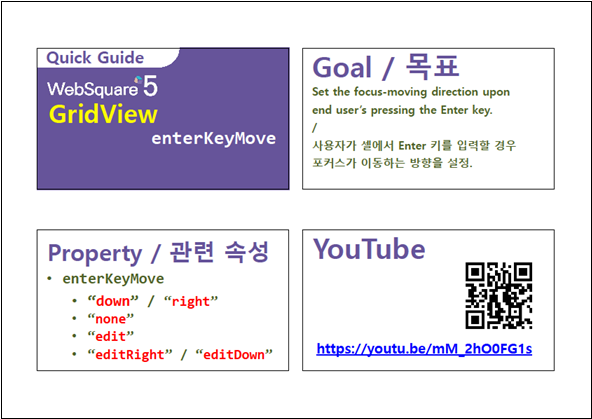
Set the focus-moving directions and whether to enter the editing mode upon the end user pressing the Enter. Set the enterKeyMove property as shown below.
"down"(Default) : Moves down upon the Enter being pressed."right": Moves to the right upon the Enter being pressed."none": No focusing is made upon the Enter being pressed."edit": Enter into the editing mode upon the Enter being pressed."editRight": Enters into the editing mode, and moves to the right cell upon the Enter being pressed."editDown": Enters into the editing mode, and moves down upon the Enter being pressed.
Download from the Internet or
View in WEBSQUARE_DEV_PACK (/GridView/_General/enterKeyMove_GridView/)
Figure 13-53.YouTube Video (https://youtu.be/mM_2hO0FG1s)
13.5.14Selecting Read-only Cells
Description |
|
|---|---|
Related APIs |
|
13.5.15Copying and Pasting Data
Description |
|
|---|---|
Related APIs |
|
13.5.15.1Deciding Data to Copy (copyOption)
copyOption is to decide which value to copy - DataList data or currently displayed data.
copyOption"dataList"(Default) : Copies the data of the DataList bound."display": Copies the currently display data on the GridView.
Video Guide – Deciding which values to copy - currently bound DataList or currently displayed values (GridView)
Sample File
13.5.15.2Deciding Data to Copy (copyType)
The copyType property is to set which data to copy from the cell.
copyType"default"(Default) : Copies the data of all focused cells. In case multiple cells are focused, all data of the focused cells are copied."native": Copies only the dragged text. In text multiple cells are dragged, only the text of the first cell will be copied.
Download from the Internet or
View in WEBSQUARE_DEV_PACK (/GridView/_General/copyType_GridView.xml)
Figure 13-54.YouTube Video (https://youtu.be/wtetKx3tna0)

13.5.16Setting Data
In case the GridView is bound with a dataList, the developer can set the data using setData();, setJSON(); or setXML(); function.
13.5.17Sorting
Description |
|
|---|---|
Related Properties |
|
Using Method |
|
13.5.17.1Sorting Multiple Columns
useCtrlOnMultisort="true" is to allow the end user to sort multiple columns by double-clicking headers while pressing the Ctrl key.
13.5.17.2Specifying the Sorting Column for Merged Columns
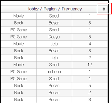
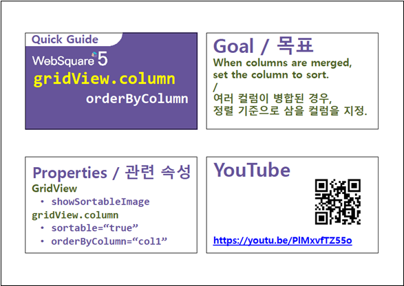
In case multiple columns are merged, specify the column based on which the sorting will be executed in the orderByColumn property. In the following example, three column headers are merged. Specify the ID of the body column based on which data will be sorted upon the end user’s clicking the sorting icon.
Download from the Internet or
View in WEBSQUARE_DEV_PACK (/GridView/Sorting/orderByColumn_gridView_column/)
Figure 13-55.YouTube Video (https://youtu.be/PlMxvfTZ55o)
13.5.17.3Sorting by Label
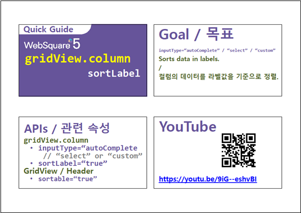
When the inputType of the GridView column is "autoComplete" or "select", the data can be sorted by label data. The sample applied to inputType="custom" column of which inputType is dynamically set as "autoComplete" or "select". For gridView.column, set the sortLabel property as "true".
Download from the Internet or
View in WEBSQUARE_DEV_PACK(/GridView/Sorting/sortLabel_gridView_column/)
Figure 13-56.YouTube Video (https://youtu.be/9iG--eshvBI)
13.5.18Filtering
13.5.18.1Column Filtering
Description |
|
|---|---|
Related APIs |
|
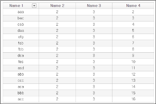
Figure 13-57.useFilter="true"
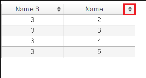
13.5.18.2Sorting/Filtering Icon
Description |
|
|---|---|
Related APIs |
|
Figure 13-58.showSortableUseFilter="true"
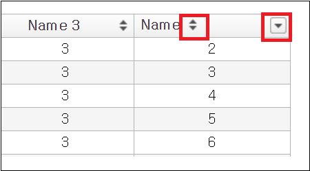
Figure 13-59.showSortableUseFilter="false"
13.5.18.3Saving User-defined Filter
Description |
|
|---|---|
Related APIs |
|
13.5.18.4Returning Only Filtered Data
When the GridView is bound with a DataList, the developer can get only the filtered data. Use getFilteredColData ( colInfo ); function of the DataList.
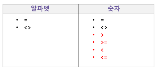
13.5.18.5Filtering Numbers vs. Filtering Alphabets
When alphabet characters are filtered, four operators '<', '<=', '>', and '>=' are not displayed. Only '=' and '<>' are displayed.
Video Guide – Filtering Numbers vs. Filtering Alphabets (gridView.column)
Sample File
13.5.18.6Display and Search of Filtering Conditions
Setting as useFilterList="true" allows display of the filtering conditions as a list.
Figure 13-60.useFilterList="false"
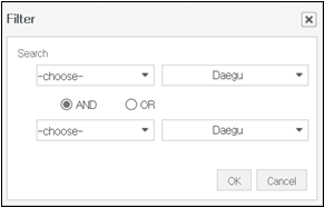
Figure 13-61.useFilterList="true"
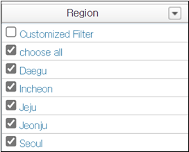
Figure 13-62.useFilterList="true"
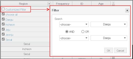
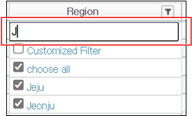
Setting as useFilterList="true" and useFilterSearch="true" at the same time will display both the filtering condition list and the input box to enter filtering conditions.
Figure 13-63.useFilterList="true" useFilterSearch="true"
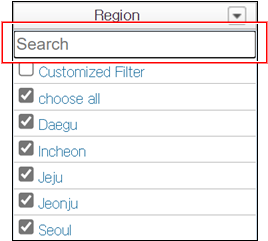
Filter box provides a search function. The following is when the end user entered capital "J". The filtering conditions including capital "J" will be searched.
Figure 13-64.Search of Filtering Condition
Download from the Internet or
View in WEBSQUARE_DEV_PACK(/GridView/_General/useFilterSearch_GridView/)
Figure 13-65.YouTube Video (https://youtu.be/VPx1BHrDEjc)
13.5.19Grouping
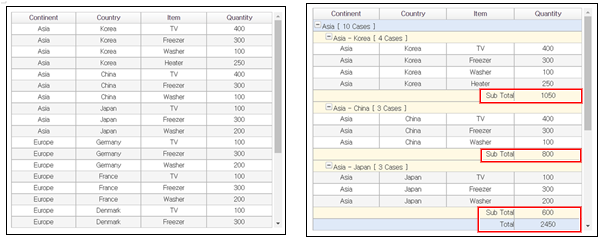
The grouping allows the end user to group GridView data by one or more columns. Use groupby() function to dynamically group the GridView data, or set as groupbyZone="true" to allow end users to conduct grouping by dragging-and-dropping columns headers of the GridView.
Figure 13-66.Before Grouping Vs. After Grouping
13.5.19.1Grouping by groupby()
Use groupby() function to dynamically group the GridView data. For the details, see the API Guide.
Code 13-22.Example
var options = {
    sortIndex: [0, 1],
    closeGroup: true,
    groupbyHeader: [{
        inputType: "expression",
        expression: 'toggle() + depthStr() + "    [ " + count() + " Cases ]  "',
        align: "left",
        colSpan: "4"
    }],
    groupbyFooter: {
        depth_0: [{
            colSpan: "3",
            value: "Total",
            align: "right"
        }, {
            inputType: "expression",
            expression: 'SUM("col4")'
        }],
        depth_1: [{
            colSpan: "3",
            value: "Sub Total",
            align: "right"
        }, {
            inputType: "expression",
            expression: 'SUM("col4")'
        }]
    }
};
gridView1.groupby(options);Download from the Internet or
View in WEBSQUARE_DEV_PACK(/GridView/Grouping/groupby_GridView.xml)
Figure 13-67.YouTube Video (https://youtu.be/1THvU4kuA5Y)
13.5.19.2Grouping & Filtering
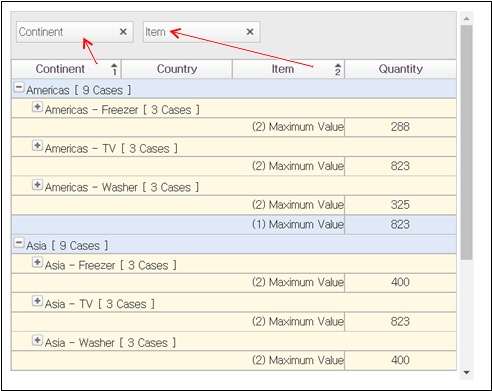
Setting as groupbyZone="true" allows the end user to directly group the GridView data by dragging-and-dropping one or more column headers. Note, however, that the ongroupby event must be defined to specify the grouping conditions. Moreover, when conducting grouping through the ongroupby event, use groupby() function.
Figure 13-68.Grouping through Header Dragging
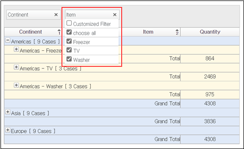
Upon the header dragged to the grouping zone being clicked, the filter will show up as shown below. In other words, the end user can conduct grouping and filtering too.
Figure 13-69.Filtering after Grouping
Code 13-23.ongroupby (Example)
scwin.gridView1_ongroupby = function(options) {
  options.groupbyHeader = [{
    inputType: 'expression',
    expression: 'toggle() + depthStr() + "    [ " + count() + " Cases ]  "',
    align: 'left',
    colSpan: 4
  }];
  options.closeGroup = true,
    options.groupbyFooter = {
      depth_0: [{
        colSpan: 3,
        value: "(1) Maximum Value",
        align: "right"
      }, {
        inputType: 'expression',
        expression: 'MAX("col4")'
      }],
      depth_1: [{
        colSpan: 3,
        value: "(2) Maximum Value",
        align: "right"
      }, {
        inputType: 'expression',
        expression: 'MAX("col4")'
      }],
      depth_2: [{
        colSpan: 3,
        value: "(3) Maximum Value",
        align: "right"
      }, {
        inputType: 'expression',
        expression: 'MAX("col4")'
      }]
    };
  gridView1.groupby(options);

};
Download from the Internet or
View in WEBSQUARE_DEV_PACK(/GridView/Grouping/groupbyZone_GridView.xml)
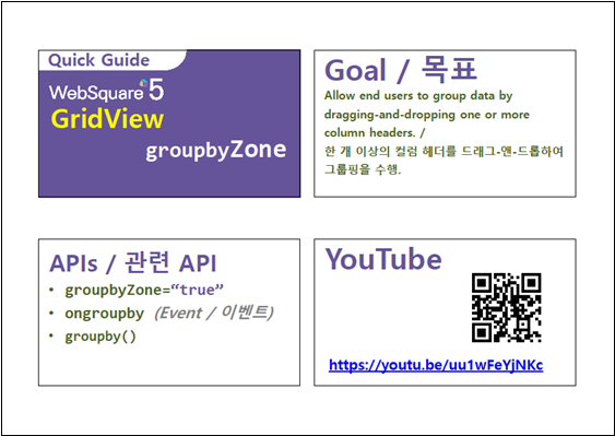
Figure 13-70.YouTube Video (https://youtu.be/uu1wFeYjNKc)
13.5.19.2.1Height of and Message on the Grouping Zone
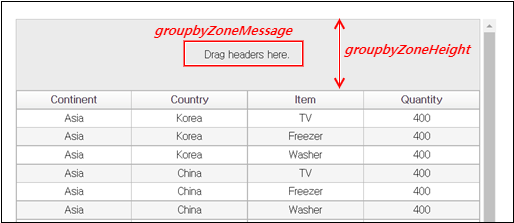
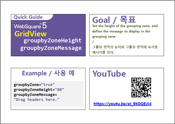
Define the height of the grouping zone with the groupbyZoneHeight property and the message to be displayed on the grouping zone using the groupbyZoneMessage property.
Figure 13-71.groupbyZoneHeight & groupbyZoneMessage
Download from the Internet or
View in WEBSQUARE_DEV_PACK
(/GridView/Grouping/groupbyZoneHeight_groupbyZoneMessage_GridView.xml)
Figure 13-72.YouTube Video (https://youtu.be/eI_9K0QEJI4)
13.5.19.2.2Limiting Number of Columns to Group by
When setting the groupbyZone property to enable the grouping function, limit the number of columns by which the GridView data is to be grouped with the groupbyMaxCount property.
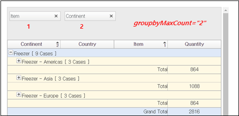
Download from the Internet or
View in WEBSQUARE_DEV_PACK(/GridView/Grouping/groupbyMaxCount_GridView.xml)
Figure 13-73.YouTube Video (https://youtu.be/H3h9EJvdoIk)

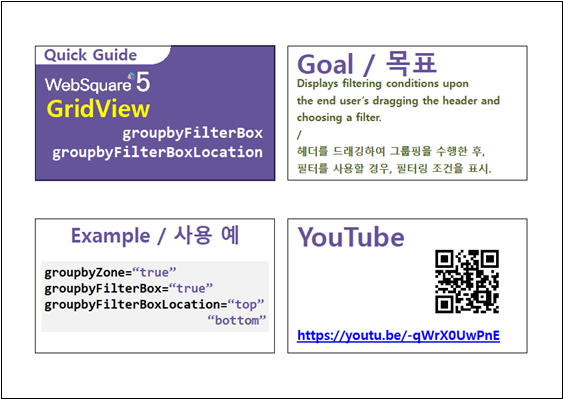
13.5.19.2.3Displaying Filter Box
Setting as groupbyZoneFilterBox="true" will display a filter box after the GridView data is grouped. The filter box displays the filtering conditions to be set by the end user and displays the filtered data according to the end user’s selection.
- Related Properties
groupbyFilterBoxgroupbyFilterBoxLocationfilterBoxVisibleRowNum
As shown below, setting as groupbyFilterBox="false" will not display filtering conditions although a filter was selected in the header after grouping.
Figure 13-74.groupbyFilterBox="false"
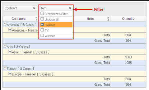
As shown below, setting as groupbyFilterBox="true" will display filtering conditions in a separate box applied after grouping.
Figure 13-75.groupbyFilterBox="true"
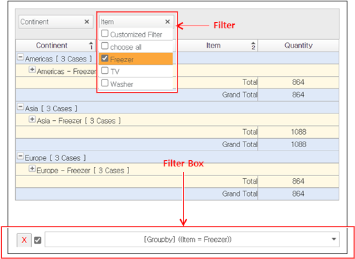
The groupbyFilterBoxLocation property allows to decide where to display the filter box ("top"/"bottom").
Figure 13-76.groupbyFilterBoxLocation="top"

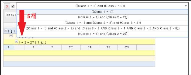
The filterBoxVisibleRowNum property limits the number of the filtering conditions to be displayed on the filter box.
Figure 13-77.filterBoxvisibleRowNum="5"
Download from the Internet or
View in WEBSQUARE_DEV_PACK
(/GridView/Grouping/groupbyFilterBox_groupbyFilterBoxLocation_GridView.xml)
Figure 13-78.YouTube Video (https://youtu.be/-qWrX0UwPnE)
13.5.19.2.4Grouping the Filtered Data
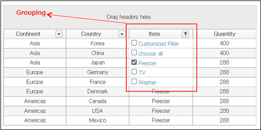
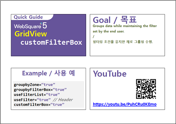
In case the GridView data can be filtered, the end user can filter the GridView data first and then group the filtered data only. For this purpose, add customFilterBox="true" setting.
The related properties are as follows:
- For filtering
useFilterList="true"useFilter="true"// To be set in the header.- For grouping
groupbyZone="true"groupbyFilterBox="true"- For keeping filters
customFilterBox="true"
As shown below, the end user can filter the GridView data first and then group the filtered data.
Figure 13-79.Selecting a Filter
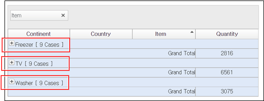
Setting as customFilterBox="true" will allow group the filtered data.
Figure 13-80.customFilterBox="true"

The filter box in the lower part shows both "Filtering" conditions and "Filtering + Grouping" conditions.
Figure 13-81.Both "Filtering" and "Filtering + Grouping" Conditions Displayed

Setting as customFilterBox="false", however, will group the entire data, not the filtered data.
Figure 13-82.customFilterBox="false"
Download from the Internet or
View in WEBSQUARE_DEV_PACK(/GridView/Grouping/customFilterBox_GridView.xml)
Figure 13-83.YouTube Video (https://youtu.be/PuhCRu0KEmo)
13.5.19.3Cancelling Grouping
Use clearGroupby() function to cancel grouping made by groupbyZone="true" setting or execution of groupby() function.
Code 13-24.Example
gridView1.clearGroupby();Download from the Internet or
View in WEBSQUARE_DEV_PACK(/GridView/Grouping/clearGroupby_GridView.xml)
Figure 13-84.YouTube Video (https://youtu.be/ODulxBbi1hY)
13.5.19.4Checking Grouping Conditions
In order to check the grouping conditions made by the groupbyZone property setting, use getGroupbyData() function.
Code 13-25.Example
// Return in JSON.
 var data = gridView1.getGroupbyData();

// Return in string.
 var data = gridView1.getGroupbyData(false);
Download from the Internet or
View in WEBSQUARE_DEV_PACK(/GridView/Grouping/getGroupbyData_GridView.xml)
Figure 13-85.YouTube Video (https://youtu.be/8QHBOsQZ4VQ)
13.5.19.5Downloading Grouped Data as an Excel File
advancedExcelDownload API allows for downloading of the GridView on which grouping has been executed. As shown below, set options.groupby="true".
Description | Downloads the GridView on which grouping has been executed as an Excel file. |
|---|---|
Value |
|
Code 13-26.Example
var options = {};
                options.fileName= "test.xlsx";
                options.type = "0";
                options.startRowIndex = 0;
                options.startColumnIndex = 0;
                options.removeColumns = "";
                options.groupby = "true";
gridView1.advancedExcelDownload( options );13.5.20Merge
13.5.20.1Automatic Cell Merge
In case same data is repeated, the cells with same data can be merged.
- Automatic cell merge
(1) All rows with same data on the same column (Row merge)
(2) All columns with same data on the same row (Column merge)
(3) Row merge followed by column merge.
(4) Column merge followed by row merge.
(5) When the left column is merged, rows of same data will be merged.
(6) When the above row is merged, columns of the same data will be merged.
13.5.20.1.1Row Merge
Related Properties |
|
|---|---|
Related Functions |
|
13.5.20.1.2Column Merge
Related Properties |
|
|---|---|
Related Functions |
|
13.5.20.1.3Row Merge Followed by Column Merge
Related Properties |
|
|---|---|
Related Functions |
|
13.5.20.1.4Column Merge Followed by Row Merge
Related Properties |
|
|---|---|
Related Functions |
|
13.5.20.1.5Merge to the Left
Related Properties |
|
|---|---|
Related Functions |
|
13.5.20.1.6Merge to the Above
Related Properties |
|
|---|---|
Related Functions |
|
13.5.20.2Dynamic Cell Merge
The following functions can conduct cell merges previously described:
Related Functions |
|
|---|
13.5.20.3Merging/Unmerging Focused Cells
Related Functions |
|
|---|
13.5.20.4 Merging Cells in Specified Zone
13.5.20.4.1Merging Cells in Specified Zone
Related Functions |
|
|---|
13.5.20.4.2Merging Cells in Specified Columns
Related Properties |
|
|---|
Code 13-27.Example (Property Setting)
mergeCells="bycol" mergeCol="col3,col5"

// (Result)
// Cells in col3 and col5 columns will be merged.
13.5.20.4.3Merging Cells on Fixed Rows
Related Properties |
|
|---|---|
Related Functions |
|
Code 13-28.Example (Property Setting)
fixedRow="4" mergeCellsFixedRows="bycol"

// (Result)
// Fix four upper rows in gridView1.
// Only the cells on the fixed rows will be merged ("bycol").
Code 13-29.Example (Method)
gridView1.setFixedRow(4);
gridView1.mergeCellsFixedRows("byrow");

// (Result)
// Fix four upper rows in gridView1.
// Only the cells on the fixed rows will be merged ("byrow").13.5.20.4.4Merging Cells on Fixed Columns
Related Properties |
|
|---|---|
Related Functions |
|
Code 13-30.Example (Property Setting)
fixedColumn="4" mergeCellsFixedCols="byrow"

// (Result)
// Fix four columns on the left.
// Only the cells on the fixed columns will be merged ("byrow").
Code 13-31.Example (Method)
gridView1.setFixedCol(4);
gridView1.setFixedRightCol(5);
gridView1.mergeCellsFixedCols("bycol");

// (Result)
// ix 4 columns on the left. // Fix 5 columns on the right.
// Only the cells on the fixed columns will be merged ("bycol").13.5.20.5Excluding Columns from Merge
Using the following APIs, the developer can select the columns to exclude from cell merges.
Related APIs |
|
|---|
Code 13-32.Example
mergeCol(3, false);
mergeByCol();

// (Result)
// Rows except the row on the 4th column will be merged.
A property named mergeCol exist.
However, megeCol property is valid for mergeCells="bycol" setting and specifies the corresponding columns IDs such as mergeCol="col1, col3".
13.5.20.6Checking Cell Merge Status
Using the following APIs, the developer can check the merge status of a certain cell.
Related APIs |
|
|---|---|
Example |
|
13.5.20.7Merging Rows of Same Data
Description |
|
|---|---|
Related APIs |
|
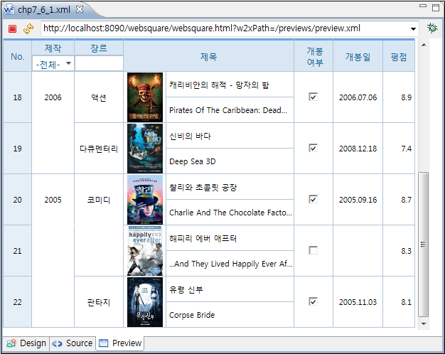
Code 13-33.colMerge & upperColumn
<w2:column id="pubDate" style="height:70px"
  inputType="select" width="60" rowSpan="2"
  dataType="" allOption="" chooseOption=""
  colMerge="true">
    <w2:choices>
        <w2:itemset nodeset="pubYear/item">
            <w2:label ref="label"></w2:label>
            <w2:value ref="value"></w2:value>
        </w2:itemset>
    </w2:choices>
</w2:column>
<w2:column id="genre" style="height:70px"
  inputType="text" width="70" rowSpan="2"
  displayType="all" colMerge="true"
  upperColumn="pubDate">
</w2:column>
Figure 13-86.colMerge
13.5.21Excel Upload (Import)
13.5.22Excel Download (Export)
See Download GridView → Excel.
13.5.23CSV Upload
13.5.24CSV Download
13.5.25Downloading Multiple GridViews to an Excel
See Multiple GridViews → Excel.
13.5.26Typical Paging
Description |
|
|---|---|
Required information |
|
Using Method |
|
<w2:pageList pageSize="2"
  displayFormat="#" id="pageList1"
  style="position:absolute;left:1px;top:410px;width:600px;height:30px;"
  buttonShowType="3">
    <script ev:event="onchange(current,before)"
    type="javascript">
        <![CDATA[

        start = current;
        $p.executeSubmission("getMovies");

      ]]>
    </script>
</w2:pageList>
<xf:submission id="getMovies"
  ref="reqMovies" target="resMovies"
  action="" method="get" mediatype="text/xml"
  encoding="UTF-8" instance="" replace="instance"
  errorHandler="" customHandler=""
  mode="asynchronous" processMsg="Searching...">
    <script type="javascript"
    ev:event="xforms-submit-done">
        <![CDATA[
      var totalCnt = WebSquare.ModelUtil
          .getInstanceValue('resMovies/rss/channel/total/@filmoTotal');

      if (totalSetYn != true) {
        var quotient = parseInt(totalCnt / display, 10);
        var remainderYn = (totalCnt % display) ? 1 : 0;
        var count = quotient + remainderYn;
        pageList1.setCount(count);
        totalSetYn = true;
      }

      var dataCnt = WebSquare.ModelUtil
          .getInstanceValue('resMovies/rss/channel/total/@filmoDisplay');
      if (dataCnt != 0) {
        var item = WebSquare.ModelUtil
            .findInstanceNode("resMovies/rss/channel/item");
        grid1.setXML(item);
      }
  ]]>
    </script>
    <script type="javascript"
    ev:event="xforms-submit">
        <![CDATA[

      var sub = WebSquare.ModelUtil.getSubmission( "getMovies" );
      sub.action = "/developGuide/getPagingData.jsp?start="
    + start + "&display=" + display;

  ]]>
    </script>
</xf:submission>
Figure 13-87.First Page of GridView
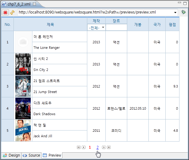
Figure 13-88.Second Page of GridView
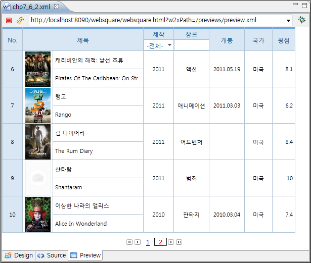
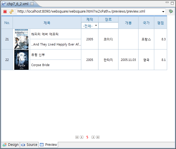
Figure 13-89.Going to the Last Page of GridView - Before

Figure 13-90.Going to the Last Page of GridView - After
13.5.27Infinite Grid
Description |
|
|---|---|
Related APIs |
|
<w2:grid baseNode="item"
  repeatNode="filmo" id="grid1"
  style="position: absolute ;left:0px;top:0px;width: 600px;height: 340px;"
  valueNode="" sortable="true" resize="true"
  readOnlyBackgroundColor="#D9E6F3"
  readOnly="false" hideHeader="false"
  rowNumVisible="true"
  rowNumHeaderValue="No."
  rowStatusVisible="false"
  rowStatusHeaderValue="Status" fixedColumn="2"
  focusMode="both" focusMove="true"
  keyMoveEditMode="true" editModeEvent="ondblclick"
  enterKeyMove="down" tooltipDisplay="true"
  oddEvenColorDisplay="false" loadCount="1">
  ...

  <script type="javascript"
    ev:event="onscrollend"><![CDATA[
    start++;
    $p.executeSubmission("getMovies");
   ]]></script>
</w2:grid>
<xf:submission id="getMovies"
  ref="reqMovies" target="resMovies"
  action="" method="get" mediatype="text/xml"
  encoding="UTF-8" instance="" replace="instance"
  errorHandler="" customHandler=""
  mode="asynchronous" processMsg="Searching...">
  <script type="javascript"
    ev:event="xforms-submit-done"><![CDATA[
      var totalCnt = WebSquare.ModelUtil
          .getInstanceValue('resMovies/rss/channel/total/@filmoTotal');
      if (totalSetYn != true) {
        output2.setValue(totalCnt);
        totalSetYn = true;
      }

      var dataCnt = WebSquare.ModelUtil
          .getInstanceValue('resMovies/rss/channel/total/@filmoDisplay');
      if (dataCnt != 0) {

        var item = WebSquare.ModelUtil
            .findInstanceNode("resMovies/rss/channel/item");
        grid1.setXML(item, true);
        output1.setValue(grid1.getRowCount());
      }
    ]]></script>
  <script type="javascript"
    ev:event="xforms-submit"><![CDATA[

    var sub = WebSquare.ModelUtil.getSubmission( "getMovies" );
    sub.action = "/developGuide/getPagingData.jsp?start="
    +start+"&display="+display ;

  ]]></script>
</xf:submission>
Figure 13-91.Scrolling-down on Grid 1
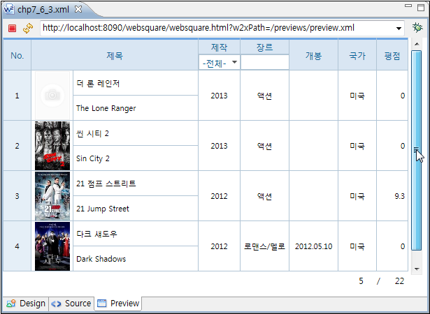
Figure 13-92.Scrolling-down on Grid 2
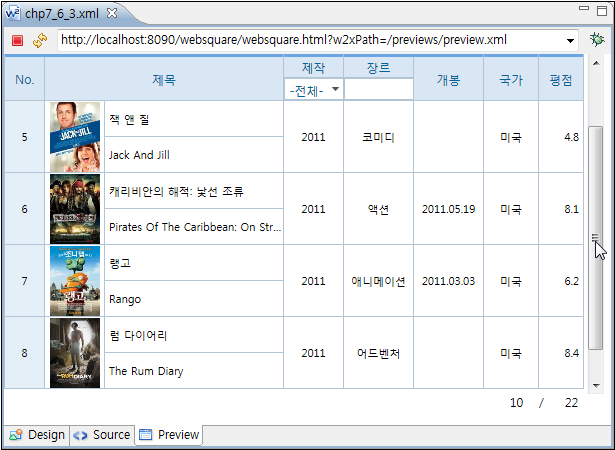
Figure 13-93.Scrolling-down on Grid 3

13.5.28Scrolling
If the mouse moves out of the GridView after selecting cells through dragging, scrolling will be made vertically, horizontally or diagonally depending on the location of the mouse.
useShiftKey=“true” | Allows the end user to select multiple cells by pressing the Shift key. |
|---|---|
dataDragSelect=“true” | Allows the end user to select multiple cells through dragging. (Valid only for useShiftKey="true".) |
dataDragSelectAutoScroll=“true” | Automatic scrolling is made upon the mouse moving out of the GridView. |
13.5.29readOnly
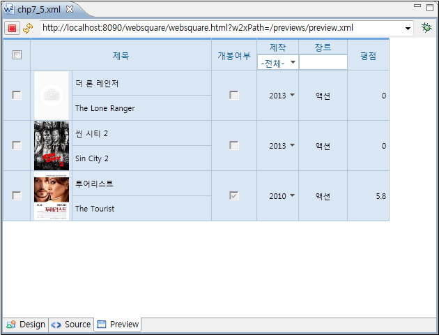
readOnly is to set certain columns only readable. APIs are also available to set rows, columns, or cells read-only. The readOnly setting can be applied to the entire GridView, rows, columns, and cells.
Description |
|
|---|---|
Related APIs |
|
Figure 13-94.readOnly="true"
13.5.29.1Selecting Read-only Cells
Description |
|
|---|---|
Related APIs |
|
13.5.30Table Title
- Related Properties
captionAuto: Automatically generates the table caption.
captionTitle: Text to use when automatically generating the table caption
Code 13-34.Example
captionTitle="Title" captionAuto="true"
When the header has three columns of Item 1, Item 2, and Item 3 and the above settings are applied to the GridView, "Table of Item 1, Item 2, and Item 3" will be generated as the caption.
N/A
CaptionTitle: Text to use when automatically generating the table caption
Figure 13-95.captionAuto"true" captionTitle="Info Table"
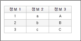
Code 13-35.Table Caption
<caption id="caption1" style="position:relative; top:100px;" value="this is a grid caption." class="setcaption">Table of Item 1, Item 2, and Item 3</caption>Figure 13-96.captionAuto"true" captionTitle=""

Code 13-36.Table Caption
<caption id="caption1" style="position:relative; top:100px;" value="this is a grid caption." class="setcaption">Item 1, Item 2, Item 3 in a Table</caption>Condition | Created Title |
|---|---|
captionAuto="true" captionTitle="Caption Title" | "Table of Item 1, Item 2, and Item 3" |
captionAuto="true" captionTitle="" | "Item 1, Item 2, Item 3 in a Table" |
When setting titleAuto="true" in the GridView, in the inputType="text" column of the header, for the <td> of each cell, the title property will be automatically generated.
The titleAuto property is not supported for the following cases. In one of these cases, directly define the title property of each cell.
(1) Header or body cells are merged.
(2) Header has two rows.
(3) Header has other inputType than inputType="text"
13.5.30.1inputType="text" / "link" / "button"
Header with Data |
|
|---|---|
Header without data |
|
13.5.30.2inputType="check" / "radio"
Header with Label |
|
|---|---|
Header without Label |
|
13.5.30.3inputType="select"
Header with Label |
|
|---|---|
Header without Label |
|
The titleAuto property is not supported in one of the following cases. In these cases, the title property of each cell must be directly defined.
(1) Header or body cells are merged.
(2) Header has two rows.
(3) Other inputType than inputType="text"
13.5.31Tooltip
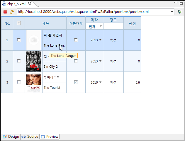
Figure 13-97.Tooltip
13.5.32Hiding Header
Description |
|
|---|---|
Related APIs |
|
Figure 13-98.GridView without Header
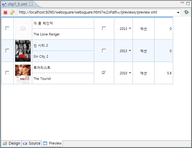
13.5.33Currency
The developer can dynamically set the amount display formats and the currency units for each column.
- Related APIs
changeCurrency: Sets the currency unit displaying formats.
euroMask, rupeeMask, tengeMask: Sets the amount displaying formats.
changeCurrency (columnID, dataType, displayFormat, delimiter, decimalDelimiter);
columnID: Column ID to apply the currency units.
dataType: Currency unit
displayFormat: Format
delimiter: Delimiter
decimalDelimiter: Decimal delimiter
Code 13-37.Example
...
gridView1.changeCurrency("col1", "euro");

gridView1.changeCurrency("col2", "number");
gridView2.changeCurrency("col3", "rupee", "##,##,###.00");
gridView2.changeCurrency("col4", "tenge", "# ###-00");
...

<w2:gridView id="gridView1"
euroMask="#.###,00" numberMask="#,###.00"
...
</w2:gridView>

<w2:gridView id="gridView2"
...
</w2:gridView>13.5.34Mapping
The developer can map the data of each column with other components. In other words, upon the end user’s selecting a certain row in the GridView, the value of the selected column will be displayed in the mapped component.
13.5.35Date Display
For dataType="date" inputType="calendar" columns, setColumnIoFormat(options); method is to define (1) date input format, (2) date display format in the input box, and (3) date display format on the calendar.
Code 13-38.setColumnIoFormat
gridView1.setColumnIoFormat(
    {
      colIndex: "col2" ,
      ioFormat:"ddMMyyyy",
      dateMask:"dd-MM-yyyy",
      useMonthYearFormat:true,
      calendarDisplayFormat:"dd-MM-yyyy"
    }
);13.5.36Context Menu
13.5.36.1Display of Context Menus
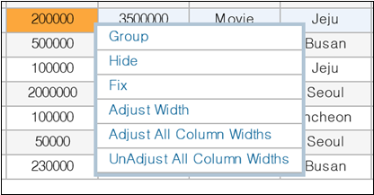
Add contextMenu="true" to display the context menus upon end user’s right-clicking the GridView.
Figure 13-99.Context Menus
13.5.36.2Displaying Context Menus through Alt + Mouse Left-clicking
By adding contextMenuAltClick=“true” , the developer can allow the end user to display context menus by pressing Alt + mouse left-clicking.
Video Guide – Displaying context menus through pressing Alt + mouse left-clicking (GridView)
Sample File
13.5.37Height
13.5.37.1Setting Initial height
In case there is visibleRowNumFix=“true” setting, the developer can set the height of the GridView depending on the visibleRowNum property.
Video Guide – Setting initial height of the GridView based on the visibleRowNum setting (GridView)
Sample File
13.5.38Rendering
13.5.38.1drawType
Using the drawType property, the developer can decide how to render the GridView on the browser. "virtual" is to render those to be shown on the browser while "native" is to render the entire GridView.
Item |
|
|
|---|---|---|
Data Volume | Recommended when the data volume is large. | Recommended when the data volume is small. |
GridView with Large-volume Data | Recommended for large-volume data because only those shown the browser are first rendered. | |
Vertical scrolling. | Setting as | |
Different Row Heights | Recommended when the GridView has different row heights ( | |
Restrictions | Setting as |
Download from the Internet or
View in WEBSQUARE_DEV_PACK(/GridView/_General/drawType_GridView.xml)
Figure 13-100.YouTube Video (https://youtu.be/JvQNnEjHWzc)

13.6Recommendations for GridView
- Recommendations
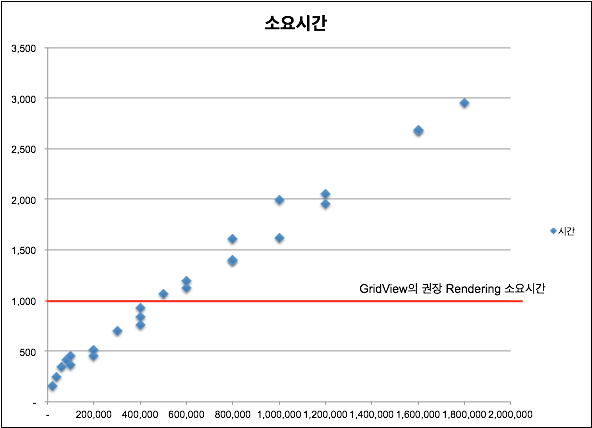
It is recommended to use not more than 50% of the memory space for the GridView to conduct search.
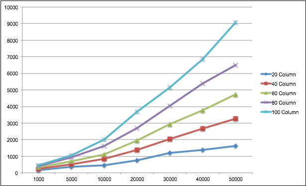
Approximately 400,000 cells are recommended to search each time.
The rendering time depends on the total cell count. The more the cells, the longer the rendering time. As the cell count grows, the rendering time more rapidly increases.
Figure 13-101.Loading Time by Number of Cells
13.7Pivot
Summary | Focuses on the pivot feature which the GridView component limitedly provided. Similar to the Pivot Table feature in the Excel. |
|---|---|
Features |
|
Remarks | Supported in IE10 and higher versions. |
Major Functions | Description | |
|---|---|---|
Axis conversion | By dragging and dropping, the end user can change the axis between the rows and the columns or use a new axis to view the table in a new dimension. | |
Column resizing | The end user can resize the header by dragging-and-dropping. | |
Automatic column width adjustment | The entire table or the last column width can be automatically adjusted based on the width of the window.
| |
File Import/Export | Excel (xsl, xsls) | File Import/Export |
CSV | ||
Context menus | The end user can fix rows and columns. | |
Formatting | User-defined menus. | |
Statistical calculations (Statistics by row, column or entire data) | Formatting options
| |
Header data filtering | Selective hiding/showing of the header data is supported. | |
DataCollection binding | DataCollection binding is supported. | |
Text alignment |
| |
13.7.1Displaying Grand Total
Adding showGrandTotal="true" will display the grand total.
Video Guide – Displaying the "grand total" (showGrandTotal) - Pivot
Sample File
13.7.2Setting Where to Display Grand Total
When showGrandTotal="true" setting is defined, the developer can set where to display the grand total by setting the grandTotalDisplayType property.
Video Guide – Setting where to display the "grand total" (grandTotalDisplayType) - Pivot
Sample File
13.7.3Setting Labels of Total Values
- In case of showGrandTotal="true",
allTotalName is to set the label of the total of the row.
grandTotalName is to set the label of the total of the column.
Video Guide – Setting labels of the total values (allTotalName & grandTotalName) - Pivot
Sample File
13.7.4Downloading Pivot into an Excel
pivotExcelDownload( opt ); is to download a Pivot into an Excel file.
Video Guide – Downloading a Pivot into an Excel (pivotExcelDownload) - Pivot
Sample File
13.7.4.1Adjusting Column Widths
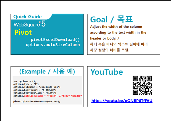
With options.autoSizeColumn, the developer can have the column width automatically adjusted based on the text length in the header or body.
options.autoColumnSize : body– Adjust the width based on the body of the Pivot.options.autoColumnSize : body– Adjust the width based on the body of the Pivot.options.autoSizeColumn : false(Default) – Not adjust the width.
Code 13-39.Example
var options = {};
options.type = "1";
options.fileName = "excelData.xls";
options.bodyFormat = "#,###,0#"; options.bodyTextAlign = "right";
options.autoSizeColumn = "false"; //“body” “header”

pivot1.pivotExcelDownload(options);Download from the Internet or
View in WEBSQUARE_DEV_PACK
(/Pivot/pivotExcelDownload_options_autoSizeColumn_Pivot.xml)
Figure 13-102.YouTube Video (https://youtu.be/oQNBP6TfFAU)
13.7.4.2Downloading after Merging Vertical Headers
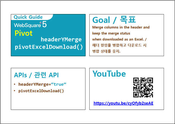
Setting as headerYMerge="true" will merge headers on the Y axis. Download the pivot using pivotExcelDownload() function after merging headers on Y axis. In the downloaded Excel file, the headers will remain merged.
Download from the Internet or
View in WEBSQUARE_DEV_PACK(/Pivot/headerYMerge_pivotExcelDownload_Pivot.xml)
Figure 13-103.YouTube Video (https://youtu.be/cyOfyb2seAE)
13.7.5Uploading an Excel to the Pivot
pivotExcelUpload( opt ); is to upload an Excel to the Pivot.
Video – Uploading an Excel to the Pivot (pivotExcelUpload) - Pivot
Sample File
13.7.6Merging Header Columns (headerYMerge)
Using the headerYMerge property, the developer can merge header columns.
Figure 13-104.headerYMerge="false"

Figure 13-105.headerYMerge="true"
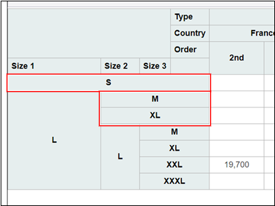
Figure 13-106.YouTube Video (https://youtu.be/z8XAjzKVfDw)

Setting as headerYMerge="true" will merge headers on the Y axis. Download the pivot using pivotExcelDownload() function after merging headers on Y axis. In the downloaded Excel file, the headers will remain merged.
Download from the Internet or
View in WEBSQUARE_DEV_PACK(/Pivot/headerYMerge_pivotExcelDownload_Pivot.xml)
Figure 13-107.YouTube Video (https://youtu.be/cyOfyb2seAE)

13.7.7Prevention of Header Columns from Being Moved (noColumnMove)
Setting as noColumnMove="true" prevents header columns from being moved by mouse dragging.
Figure 13-108.YouTube Video (https://youtu.be/jOGforAhQk4)
