11.Drawing
11.1Drawing a Component
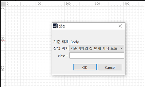
11.1.1Static Mode (Click & Click)
Select a component on the Palette view and add the component on the Design view in the Flexible or Static mode.
Static | Absolute | |
|---|---|---|
Drawing Method | Click & click. | Click & drag. |
Description | The position of the component selected on the Palette will be decided based on the existing component position. | The developer can draw the component on the Design tab. |
Recommended Environment | When editing an existing UI or adding a new component | When creating a new WebSquare XML |
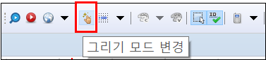
Click the Change Draw Mode icon on the toolbar.
Select the component on the Palette.
Define the position and the Float property of the component.
Go to the Component view, and check if the component has been successfully added.
Figure 11-1.Static Mode
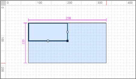
11.1.2Absolute Mode (Click-n-drag)
Select a component to add on the Palette.
Drag the component on the Design tab. The developer can decide the position and size of the component. (Double-clicking will create a component in the default size in the selected location.)
Go to the Component view, and check if the component has been successfully added.
Figure 11-2.Absolute Mode
11.2Setting Style
Every component has id, style, and class properties. The developer can customize the component style by define CSS.
Figure 11-3.Style View

11.2.1Applying CSS
The CSS can be applied in one of the three ways to be described below.
11.2.1.1Adding on the Style View
Click the component to set the style on the Design tab.
Click the Style view.
Set the style on the style tree or the editor.
Go to the Design tab, and check if the style has been applied.
11.2.1.2Using Add Internal Style button or class Property (In-line)
Go to the Style view.
Click the Add Internal Style on the upper-right corner.
Check if the Source tab opens and the following code is generated.
Code 11-1.Style Setting
<style type="text/css"><![CDATA[ ]]></style>
Define the class within CDATA[ ].
Click the Class view.
Check if the defined style is displayed on the Class view.
Set the class of the component to apply the style.
Code 11-2.Style (Example)
<script type="javascript">
    <![CDATA[
    .back {
    background-color: #C0C0C0;
    }

    .text {
    font-size: 25px;
    font-weight: bold;
    color: #0080FF;
    }

    .border {
    border-width: 5px;
    border-color: #800040;
    }

]]>
</script>11.2.1.3Importing CSS File
Go to the Style view.
Click the Import External Style icon on the upper-right corner.
Select the CSS file.
Click the Class view.
(Or, instead of Steps 2 ~ 4 above, drag the CSS file from the Project Explorer to the Design tab.)
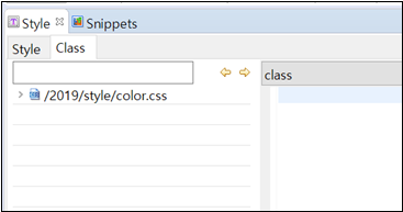
Go to the Class view, and check if the CSS has been added.
Go to the Design view, and click the component to apply the external CSS.
Click the Class tab on the Style view, and click the newly added external CSS.
(Double-clicking the currently applied CSS will cancel the CSS.)
Check if the style classes are displayed.
Double-click the style class to add.
Go to the Design view, and check if the corresponding class is being applied.
(The applied CSS is displayed in bold on the Class view.)
Set the class of the component to apply the style.
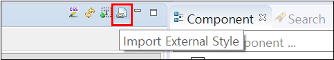
Figure 11-4.Drag-n-drop
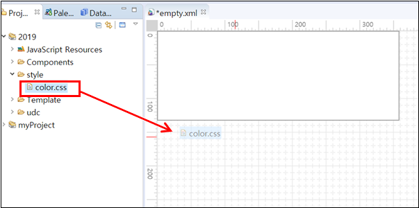
Figure 11-5.Checking CSS File on the Class View
In order to edit the external CSS file, the developer must open the CSS file and edit the contents on the file.
1. Click the Class view on the Style view.
2. Right-click the class to edit, and select [Open File].
3. The CSS file containing the class will be displayed on the Source view, and the corresponding class will be focused.
4. Edit the class and save it.
11.2.2CSS Tips
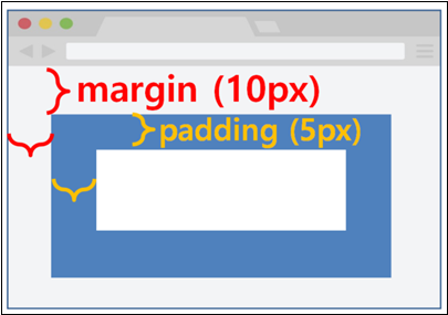
11.2.2.1margin vs. padding
Figure 11-6.margin: 10px; padding: 5px;
11.2.2.2Block-level Element Styling
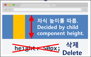
By deleting the width setting of a block-level element, the developer can fill the full width with the block-level element. Also, by deleting the height, the developer can have the height of the block-level element automatically decided based on the height of the child component contained in the block.
Group
TextBox
GridView
Figure 11-7.Deleting the width setting
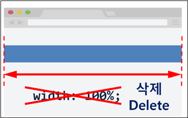
Figure 11-8.Deleting the height setting
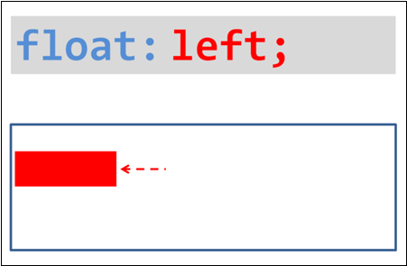
11.2.2.3float & overflow
float is to decide where to put the component - right or left.
Figure 11-9.float: right;
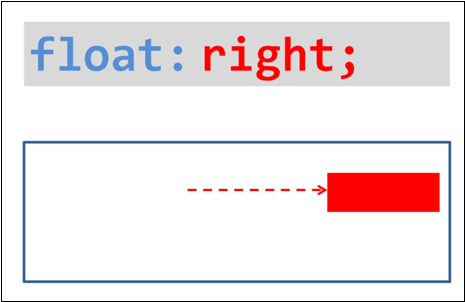
Figure 11-10.float: left;
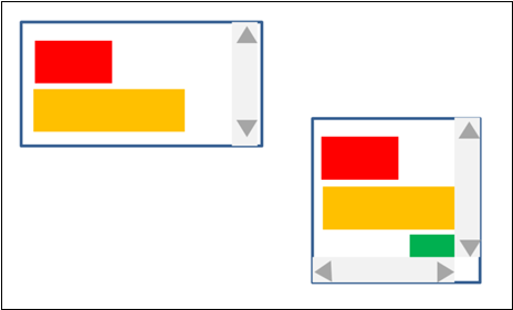
overflow decides how to render overflowing components.
Figure 11-11.overflow: hidden; or overflow: auto;

Figure 11-12.overflow: scroll;
11.2.2.4Group Styling
After wrapping multiple components with Group, apply CSS to the Group. Then, the style will be applied to all components within the Group resulting in better speed and convenience.
11.3Setting Properties
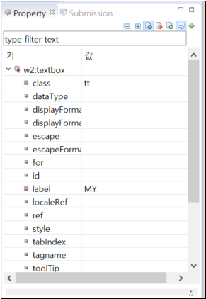
For the component drawn in the 8.3 Design view, the developer can set the properties on the 8.6 Property view.
Click the component to set the properties on the 8.3 Design view. (Or, go to the 8.7 Output tab and select the component to set the properties.)
Set the properties on the 8.6 Property tab. (For more information about each property of the component, see API Guide.)
Figure 11-13.Setting Properties on the Property View
11.4Adding Events
All contents written on the Script tab is defined within <head> - <script type="javascript"><![CDATA[ ]></script>. The list of all JavaScript codes within the <script> node on the Script tab.
11.4.1Writing New Scripts
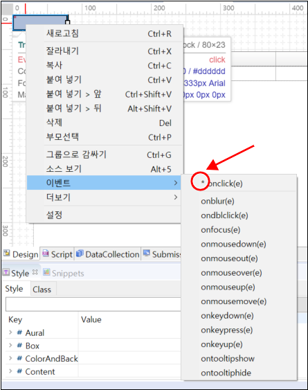
Right-click the component.
Click [Add Event] and choose an event. (For the events available for each component, see API Guide.)
Figure 11-14.Adding Events
Check if the Script tab is opened and the event function is created as shown below.
Code 11-3.Event Handler
// scwin.componentName_eventName
Define the event function as shown in the example below.
Code 11-4.Defining Event Handler
<head>
    <script type="javascript">
        <![CDATA[
        scwin.trigger4_onclick = function(e){
            var name = input1.getValue();
            output1.setValue( name );
        };
    ]]>
    </script>
</head>
<body>
    <xf:trigger id="trigger4" style="" type="button"
        ev:onclick="scwin.trigger4_onclick">
        <xf:label>
            <![CDATA[OK]]>
        </xf:label>
    </xf:trigger>
</body>
Check if the added event is displayed on the list left to the 8.4 Script tab.
Go to the 8.6 Property view and click the Show Event Only icon, and check if the event has been added.
All contents written on the Script tab is defined within
<head> - <script type="javascript"><![CDATA[ ]></script>. The list of all JavaScript codes within the <script> node on the Script tab.11.4.2Using Existing Scripts
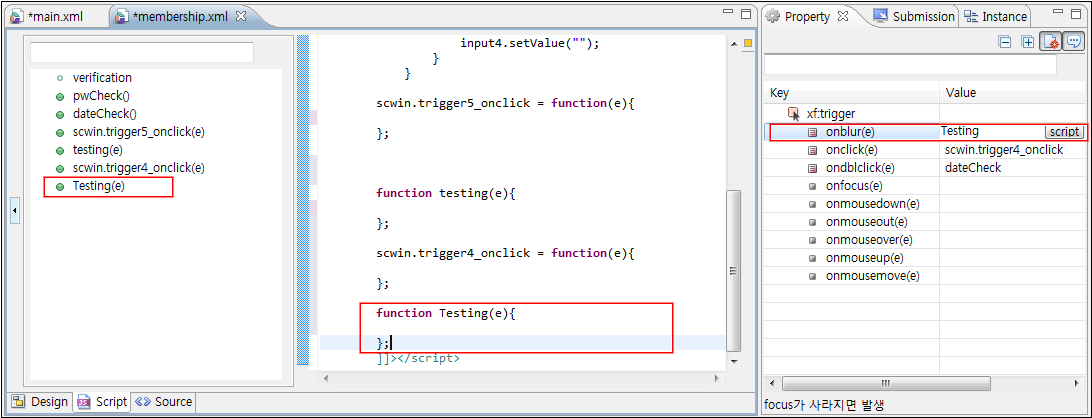
Right-click a component on the Design tab or Component view.
Click [Add Event] and choose an event. (For the events available for each component, see API Guide.)
Click the Value column of the event.
Enter the name of the existing function.
Click Script button.
Check if the function is created on the 8.4 Script tab.
Code 11-5.Using Existing Scripts
<xf:trigger id="trigger4" style="" type="button"
    ev:onclick="scwin.trigger4_onclick"
    ev:ondblclick="dateCheck"
    ev:onblur="Testing">
    <xf:label>
        <![CDATA[OK]]>
    </xf:label>
</xf:trigger>
Figure 11-15.Added Event
11.4.3Checking the Event-triggered Component
$p.getEventTarget() or WebSquare.util.getEventTarget() functions are to check the component that fired the event. As shown in the following example, the developer can check the name and the ID as well as the full ID of the component that fired the event.
Code 11-6.Example
scwin.trigger1_onclick = function(e) {
    var info = $p.getEventTarget(this);
 // var info = WebSquare.util.getEventTarget(this);
    var pluginName = info.pluginName;
    var id = info.id;
    var realId = info.realId;
    alert(pluginName + id + realId);
};
Code 11-7.Component Information
{
     "pluginName": "Name of the component",
     "id": "ID of the component",
     "realId": "Full ID of the component including the top-level WFrame ID
}
Video Guide – Checking Event-fired Component ($p & WebSquare.util)
Sample File
11.5Dynamically Creating Components
$p.dynamicCreate(); function is to dynamically create components.
11.6Adding Objects
On the Script tab, the developer can define following objects.
11.6.1Browser Object
Code 11-8.Browser-provided Object
window.open('http://');11.6.2User-defined Object
The developer can define variables, functions, and objects.
var userName = "WebSquare";

function getUserName() {
    return userName;
};

var info = {
    name: "WebSquare",
    city: "Seoul"
};

var common = {
    isNumber: function(tmpVal) {
        return Number(tmpVal);
    }
};11.6.3WebSquare Object
Hence, the WebSquare object names must not overlap with browser object or user-defined object names.
11.6.3.1Utility
Code 11-9.Utility
var curDate = $p.getCurrentServerDate('yyyy-MM-dd');
// Getting date information from the WAS11.6.3.2UI Object
Code 11-10.UI Object
inputbox1.setValue("WebSquare");
// Set the value of the "inputbox1" ID as "WebSquare".11.6.3.3Data Object
Code 11-11.Data Object
curRowDataObj = datalist1.getRowJSON(0);
// Access "datalis1", and
// get the data of the row of which index is 0.
11.7Checking on the Browser
The developer can check the pages on the browser.